Final Major Project
ASSIGNMENT
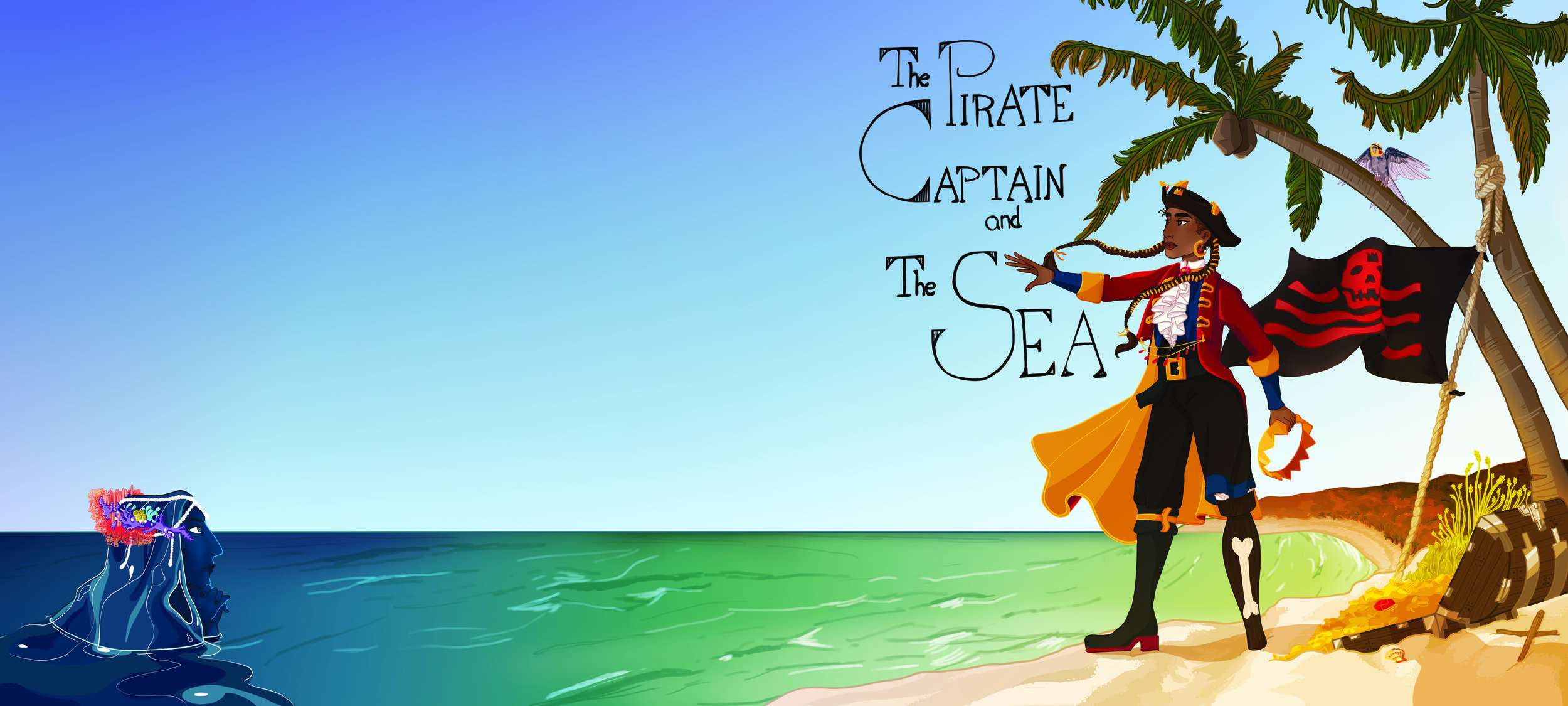
Children’s Book: The Pirate Captain and The Sea
COMP1785: Animation Project : Thea Jacobsen : 000940748-0
This tab corresponds directly to the COMP1785 submission; please view this as the culmination of the portfolio as a whole. It builds on the research, work and opinions presented in the portfolio, not all of which are mentioned within “Assignment”. Research, Design and Script deal with the step-by-step creation of the book, especially looking at the specific choices made throughout the process. “Assignment” deals with the broader reflection on the project as a whole.
Please navigate the work provided with that in mind.
Table Of Contents
Research:
Why
Pirate Research
Children’s Book Research
Reaching Out to Schools
Planning and Product Development
Exhibition Development
Design:
Visual Research
Concept Art
Script:
Script Iterations
Page Drafts
Colour Script
Workflow
Assignment:
Introduction
Pre Production
Production
Introduction

In 2018, 5 out of the “Top 10 most challenged books” on the Office for Intellectual Freedom’s (OIF) list were banned due to LGBT themes. Amongst these are books such as; “And Tango takes Three”, published in 2005 and telling the story of two male penguins raising a chick together, and “A Day in the Life of Marlon Bundo”, published in 2018, about a rabbit who gets married to another male rabbit. Both of these books depict homosexual relationships in its most innocent form. Written in wildly different times “And Tango takes Three” written in the early 2000s has been number one the OIF’s most challenged list almost every year since its release. In contrast “A Day in the Life of Marlon Bundo” was written in 2018. Three years after the Supreme Court ruled that the “Fourteenth Amendment requires all states to grant same-sex marriages, and recognize same-sex marriages granted in other states.”(En.wikipedia.org, 2019) “A Day in the Life of Marlon Bundo” has explicit imagery of LGBT marriage and even though this book was released after the Supreme Court’s ruling, it is still facing censorship challenges in schools and libraries across the United States. The majority of the books challenged are books aimed at children and the people making the complaints are parents and patrons. The American Library Association’s Office for Intellectual Freedom is fighting to stop this censorship. The restriction on media, be it books or film/TV, is hindering the future generation of children from seeing and learning about the diversity in the world. Furthermore, the fact that these books are still being challenged because they contain a healthy representation of LGBT+ character and stories show that we still have a long way to go before we reach equality.
However, books cannot be censored everywhere. We are seeing more and more books, film and TV representing LGBT+ issues and characters. Books like “And Tango takes Three” and “A Day in the Life of Marlon Bundo” are available in most bookstores. With more and more being written every year. “Julian is a Mermaid” is a book about a young boy who wants to dress up as a mermaid, written in 2018 it won the 2019 Stonewall Book award. This is one example of a book dealing with issues outside of the heteronormative and there are many more like it. “Prince and Knight”, “Heather Has Two Mommies” and “I am Jazz”, are just some examples of the ever-widening library of LGBT books for children. It is not only children’s books that are gradually diversifying, but cartoons are also becoming more inclusive. Popular series like “Steven Universe”, “Adventure Time”, “The Legend of Korra”, “The Amazing World of Gumball” and “She-Ra and the Princesses of Power” all feature confirmed LGBT+ characters and relationships. That is a great step in the right direction. However, sadly also they suffer from censorship. “Steven Universe” has been frequently amended in its international release to limit the extent of the queer representation. Below is the clip in question, the censoring involved editing out a scene where two female characters dance together. The divergence in editing starts after 01:50.
The European branch of Cartoon Network addressed this on Facebook in 2016 after receiving criticism about the censoring of the show. This is what they said.
“The US broadcast system requires that shows are marked with a rating - in this case, PG (parental guidance necessary). In the UK we have to ensure everything on air is suitable for kids at any age at any time. We do feel that the slightly edited version is more comfortable for local kids and their parents. [...]” (Cartoon Network Europe, 2016)
They then proceeded to complete their statement by saying:
“Be assured that as a channel and network we celebrate diversity - evident across many of our shows and characters.” (Cartoon Network Europe, 2016)
Whilst this is true to some extent, the fact that LGBT characters are still being actively censored to a much larger extent than their heterosexual counterparts shows that we still have a long way to go before we reach true acceptance. The fight for positive representation has always been prevalent in groups that have felt marginalized. However, in recent years it has gained more focus within media and we are starting to see more positive changes being made. It is in this landscape this project is born.This is the time of duality, where cultures and generations meet creating tension between those who fight for an equal and diverse future, and those who cling to traditional ideals.
“The Pirate Captain and The Sea” is a book project started to aid in the fight for representation. However, I did not want the story to revolve around being queer, this is a love story between two people, where their gender doesn’t matter. The purpose of the book is to show a story that has integrated queer characters that live their life without judgement. Statistically, some percentage of children are going to be queer, but the book is not meant to target these children. Firstly, that would be impossible, as children are yet to grow into their own and discover those parts of their identity. Secondly, this is not the point, the book exists merely as a way to show people that queer people exist, and by shedding light on this demographic, contribute to a more tolerant future. One of the arguments against LGBT representation in children’s media is that it is promoting a political agenda and “turning children gay” and that anything outside the heteronormal is somehow explicit. These are uneducated claims that reflect an outdated opinion founded in homophobia. Whilst these ideas are difficult if not impossible to change in an adult, it is no impossible to make a change for future generations. By having more, and better representation for children we can help create a more tolerant world where one doesn’t discriminate based on sexuality or gender identity.
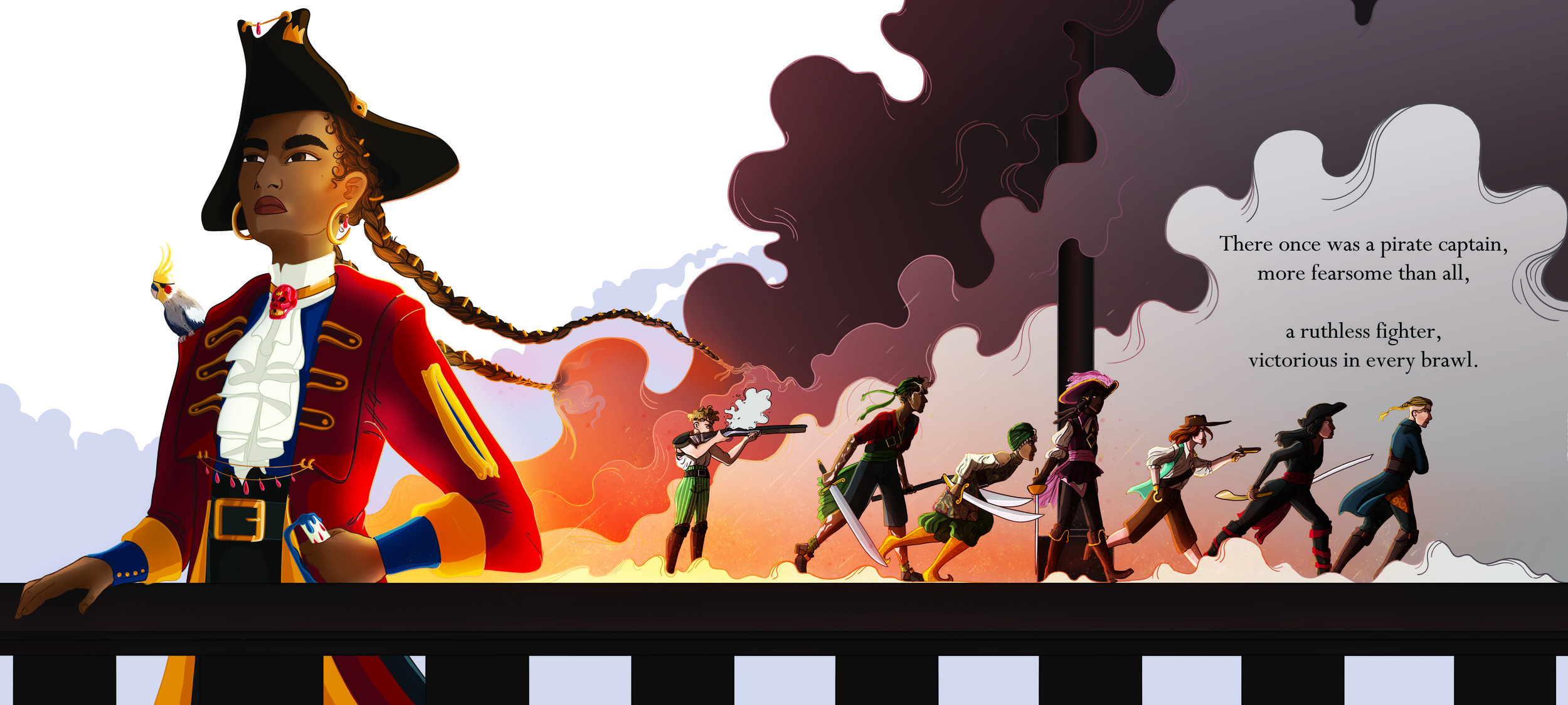
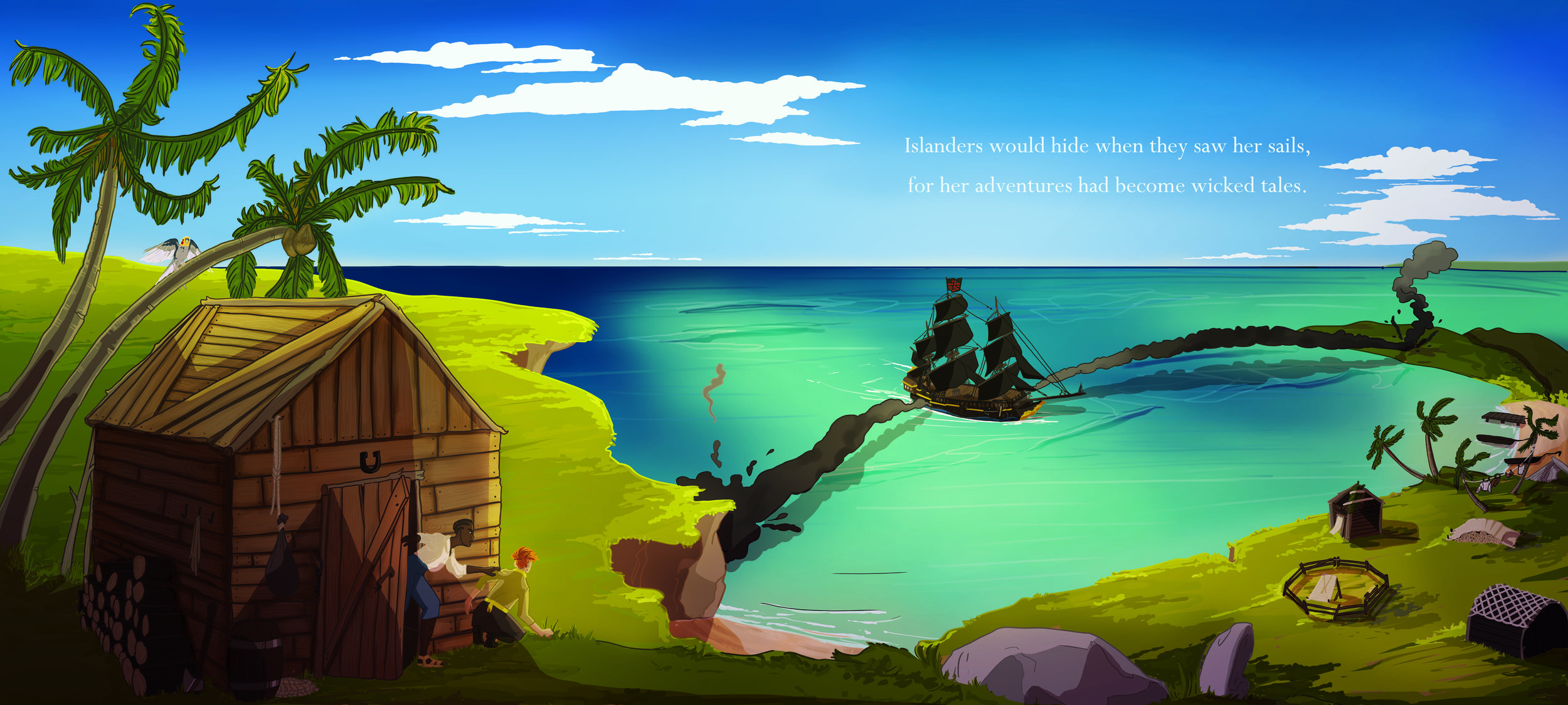
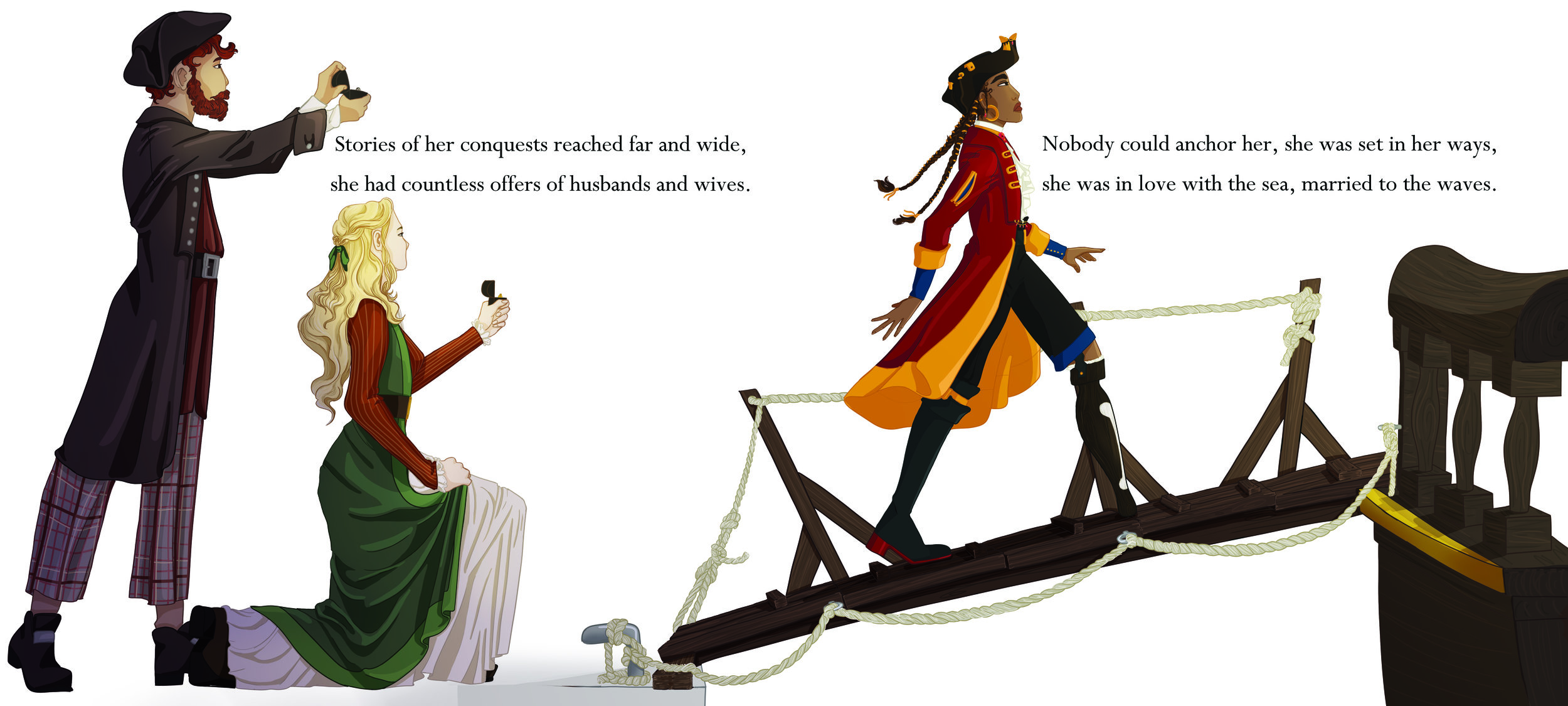
The Pirate Captain and The Sea
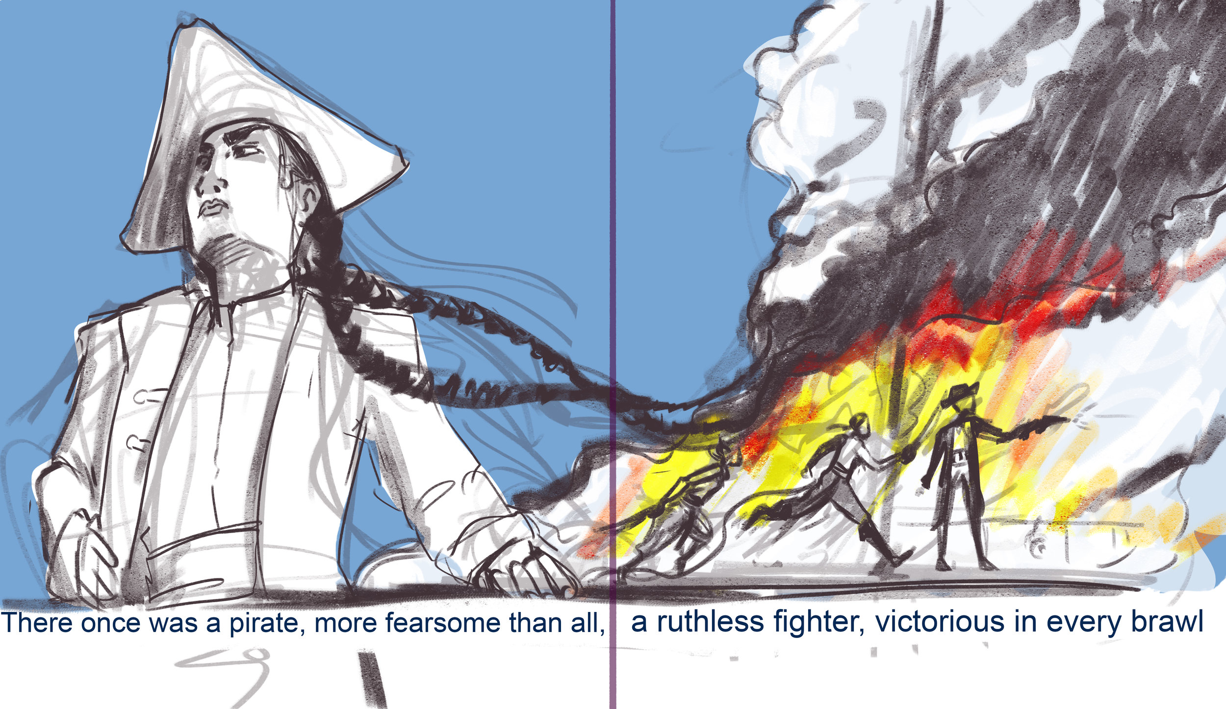
There once was a pirate captain, more fearsome than all,
a ruthless fighter, victorious in every brawl
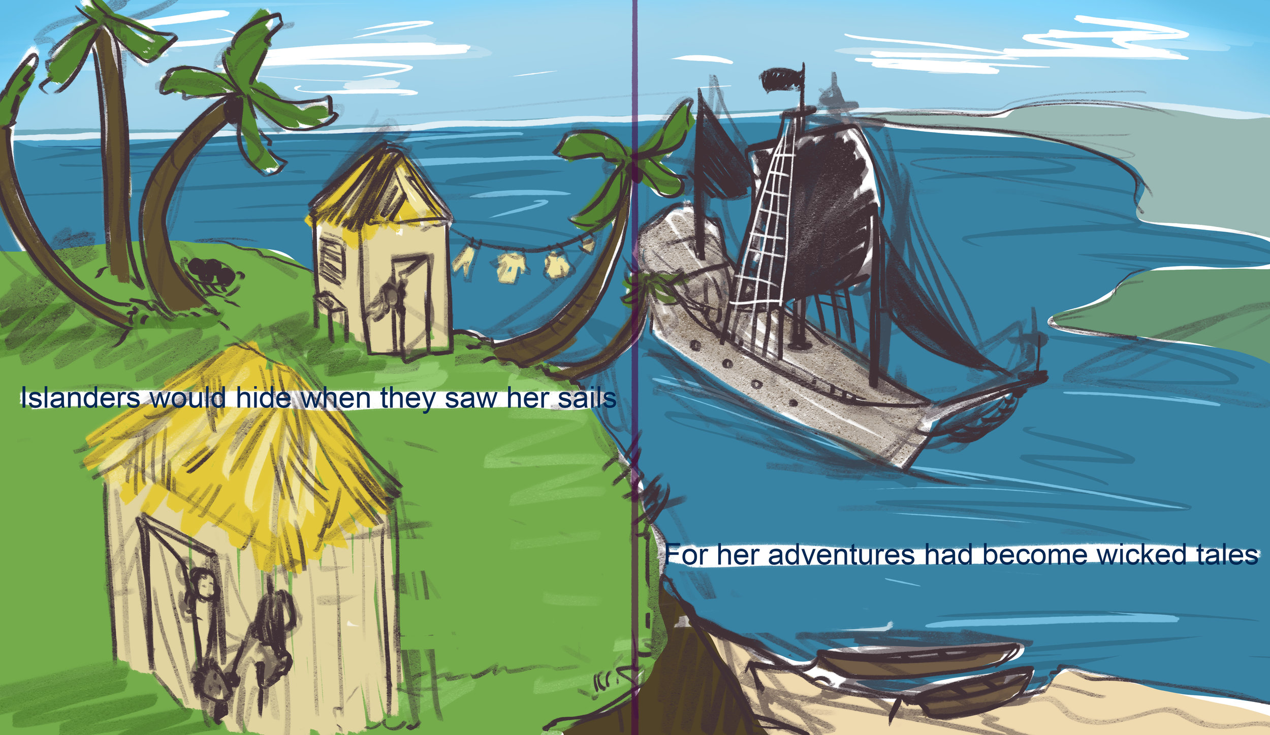
Landlubbers would hide when they saw her sails
For her adventures had become wicked tales
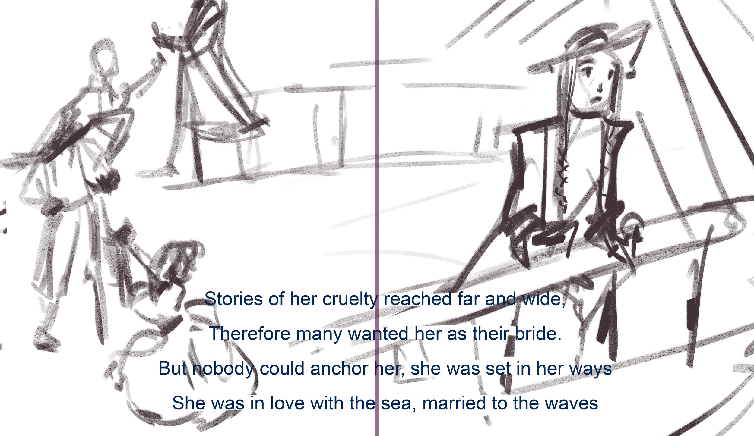
Stories of her conquests reached far and wide,
She had countless offers of husbands and wives
Nobody could anchor her, she was set in her ways
She was in love with the sea, married to the waves
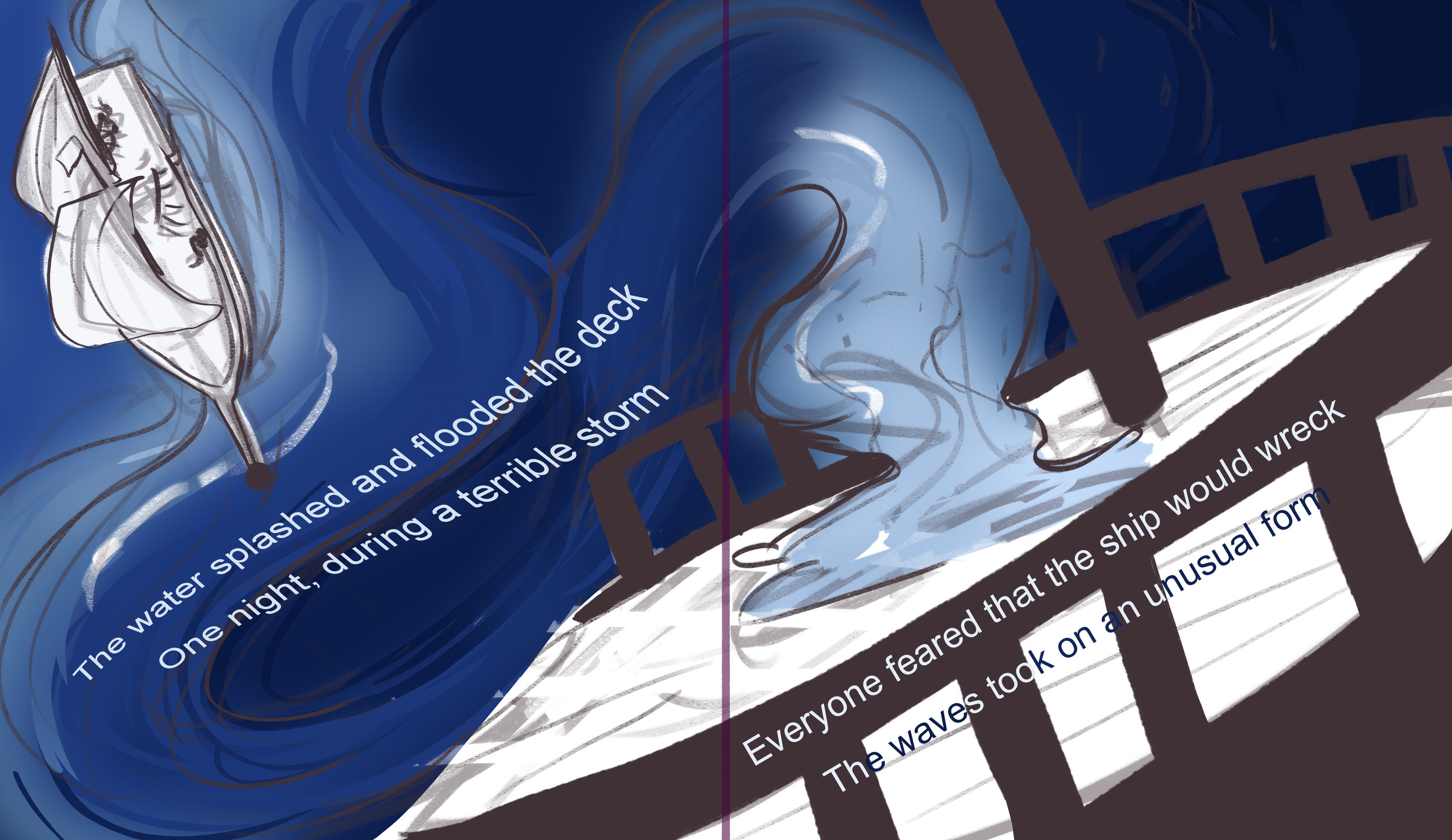
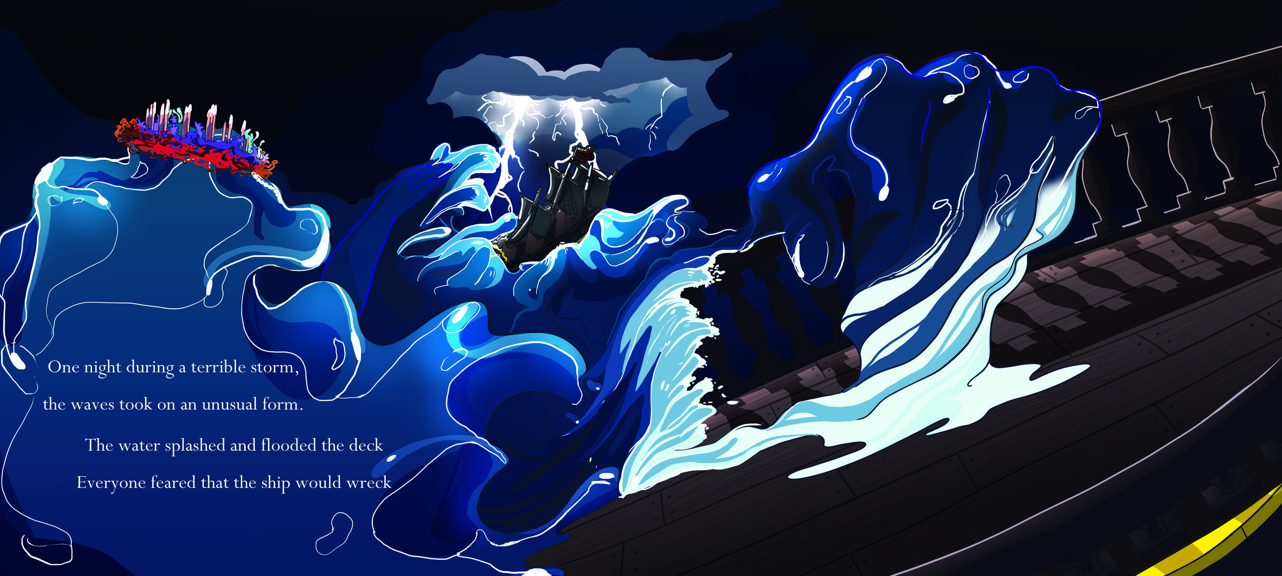
One night during a terrible storm
The waves took on an unusual form
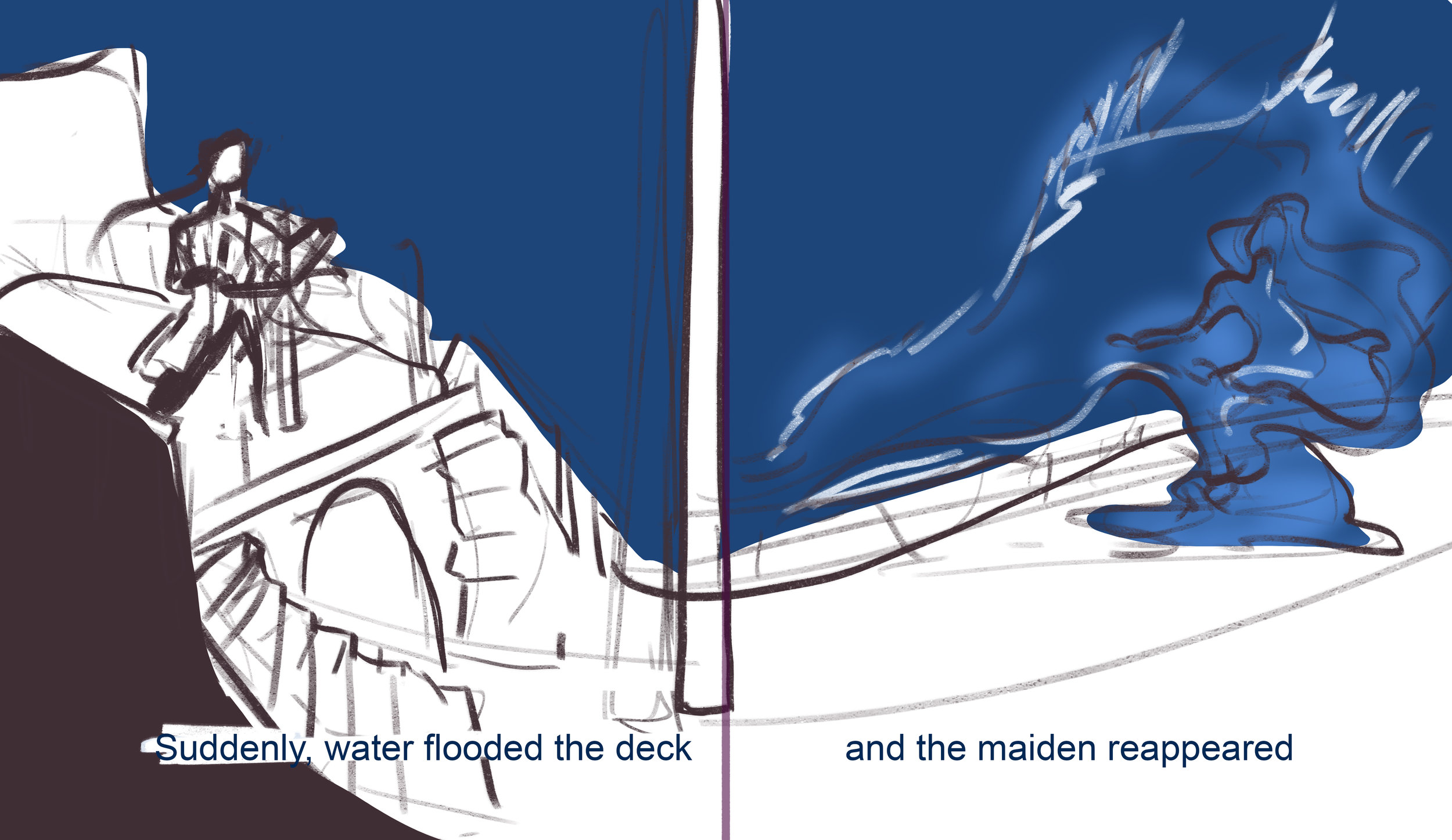
The water splashed and flooded the deck
Everyone feared that the ship would wreck
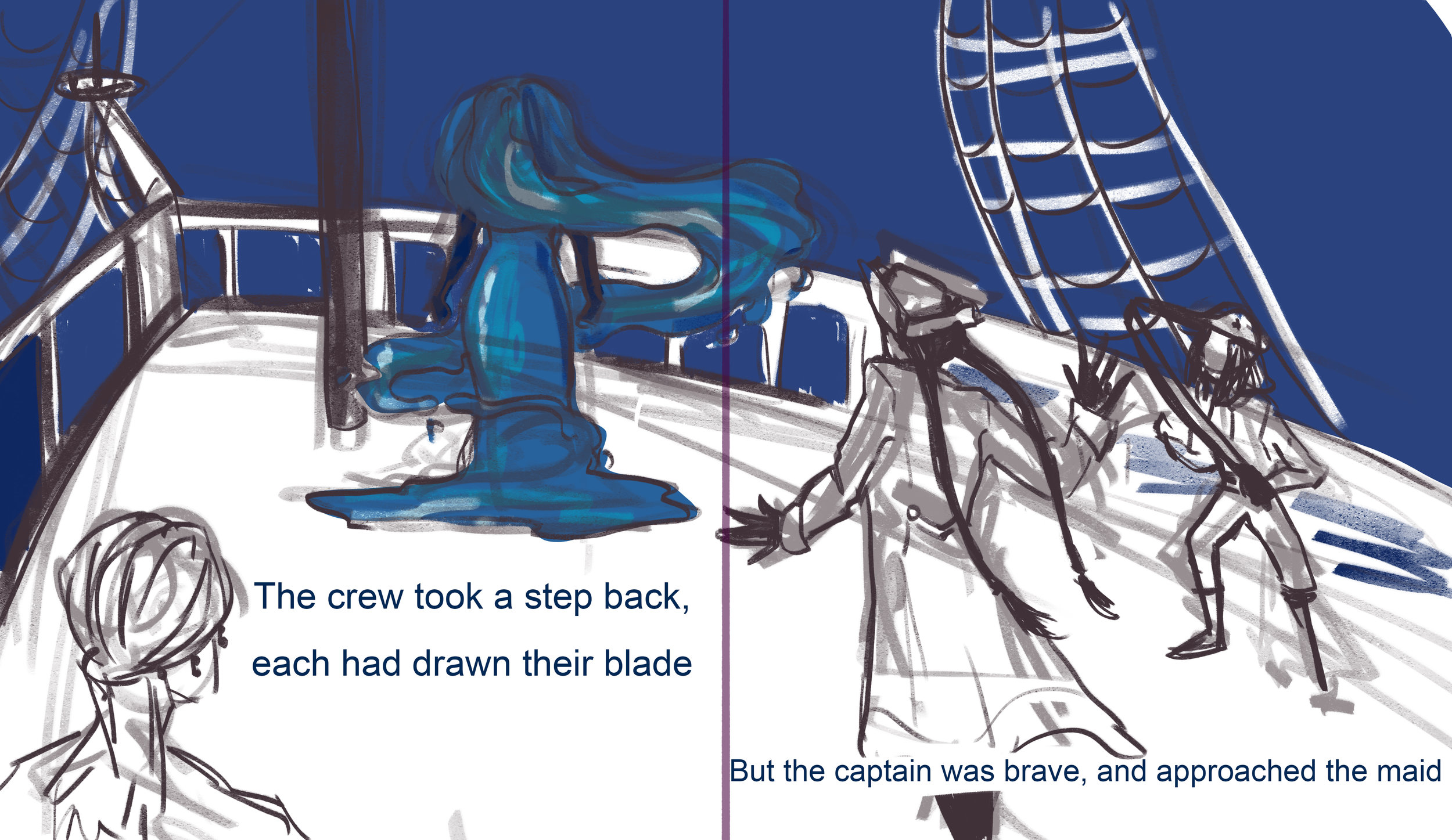
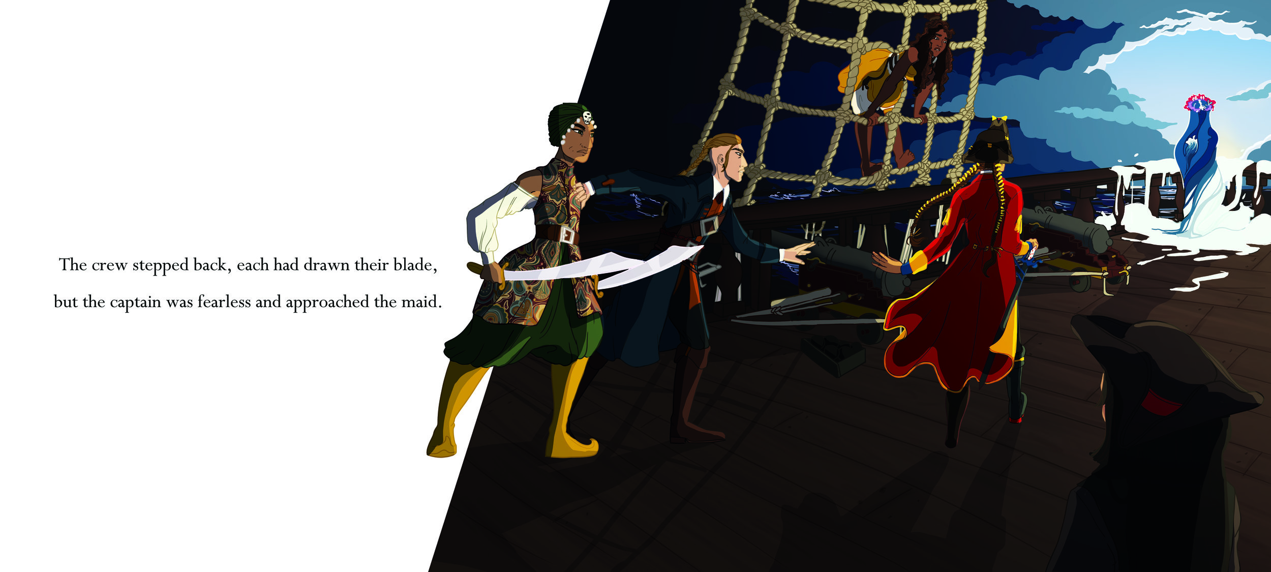
The crew stepped back, each had drawn their blade,
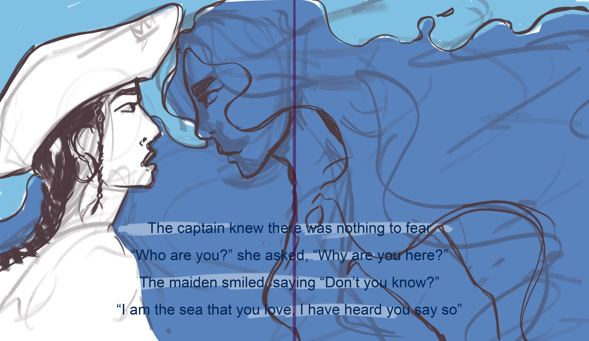
But the captain was fearless and approached the maid
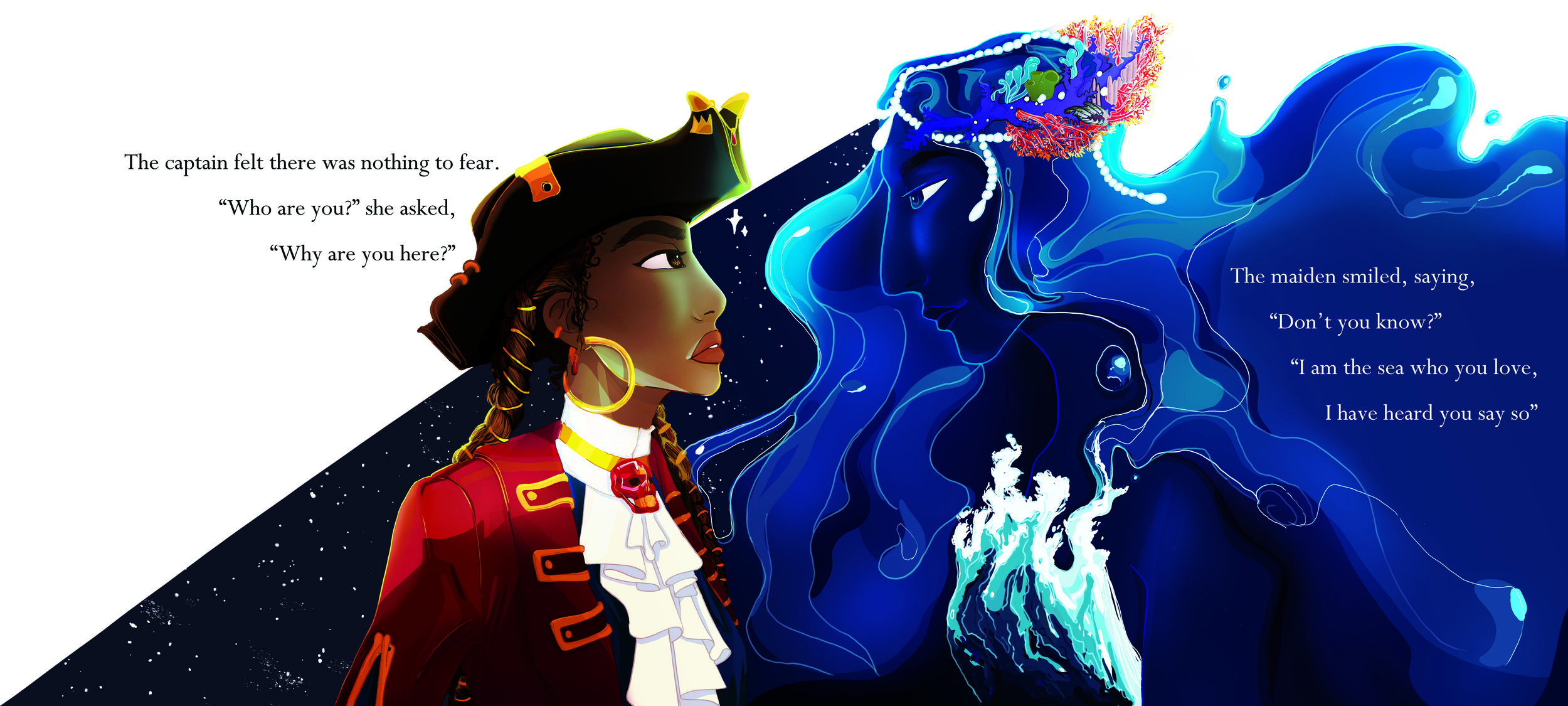
The captain felt there was nothing to fear
“Who are you?” she asked, “Why are you here?”
The maiden smiled, saying “Don’t you know?
I am the sea that you love, I have heard you say so”
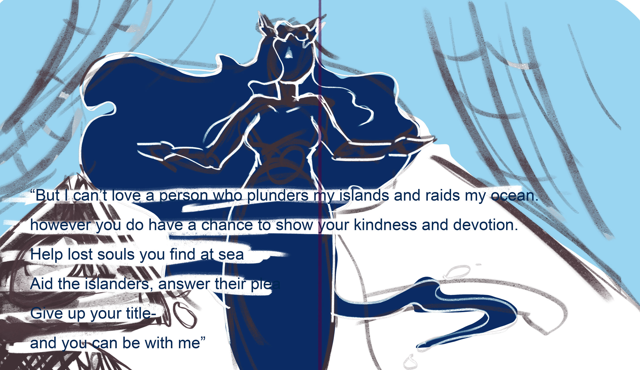
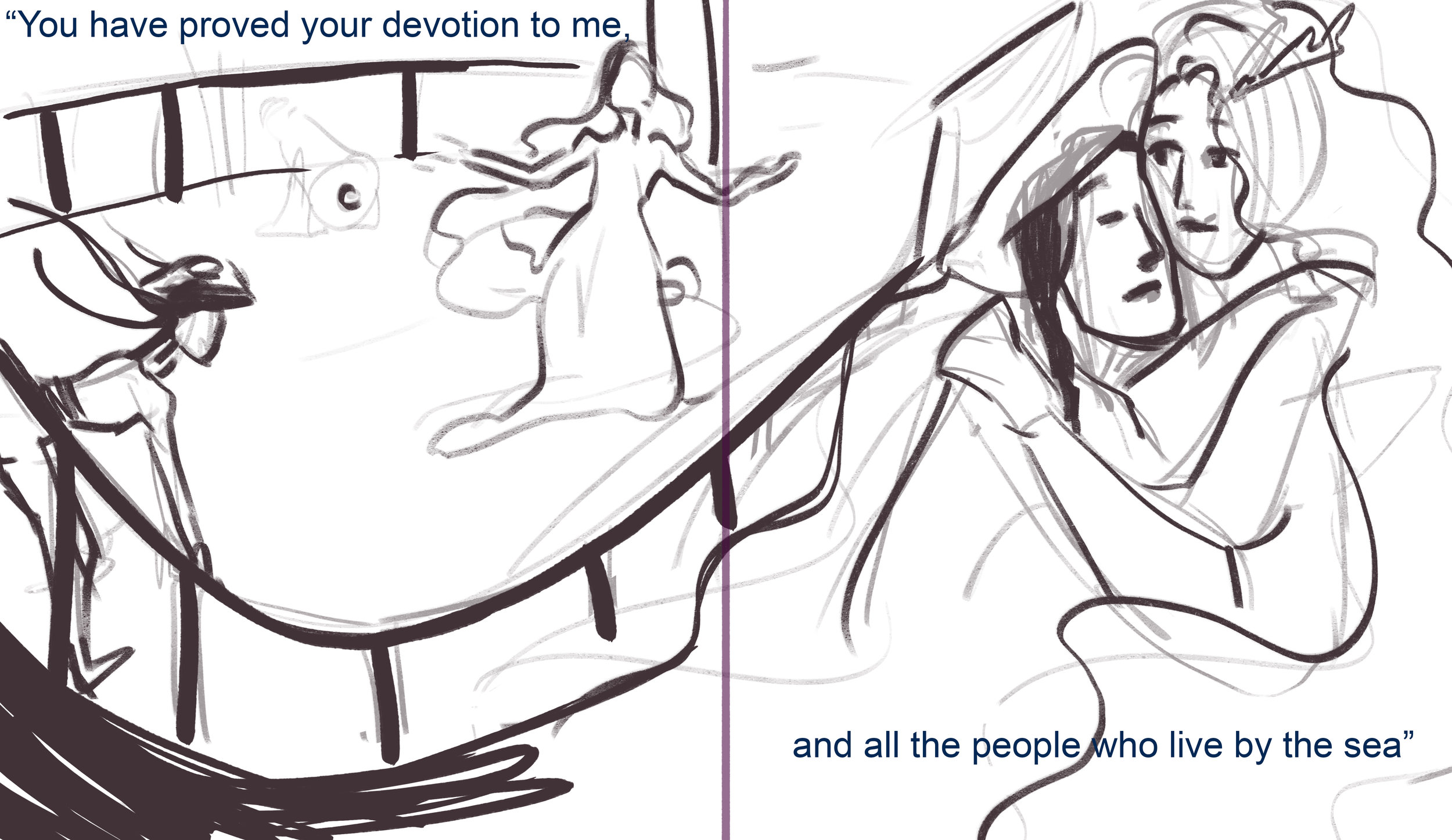
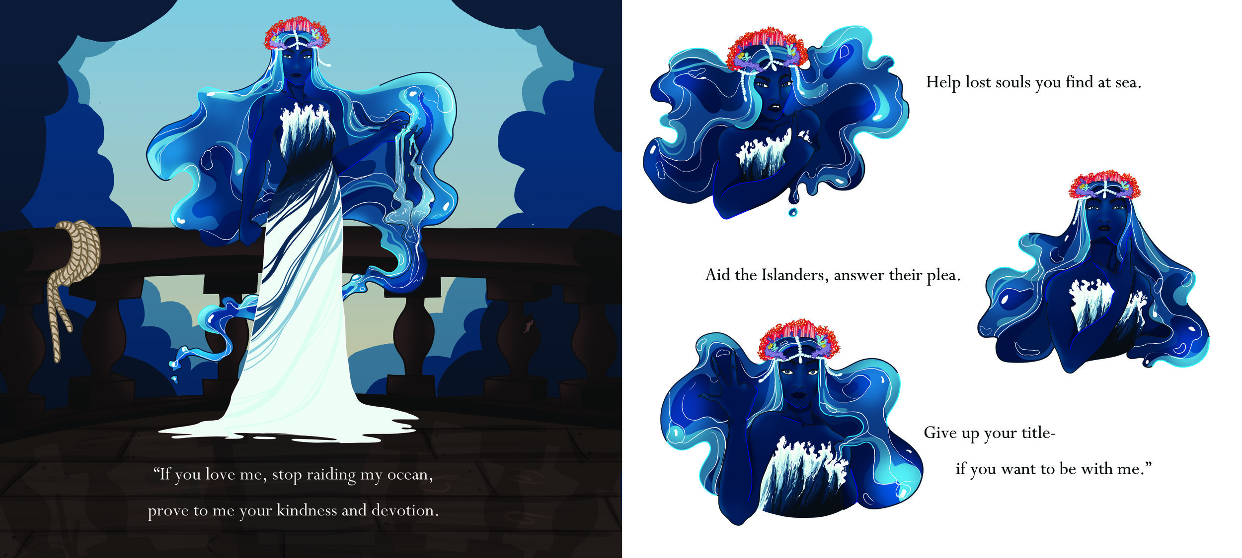
“If you love me, stop raiding my ocean
prove to me your kindness and devotion
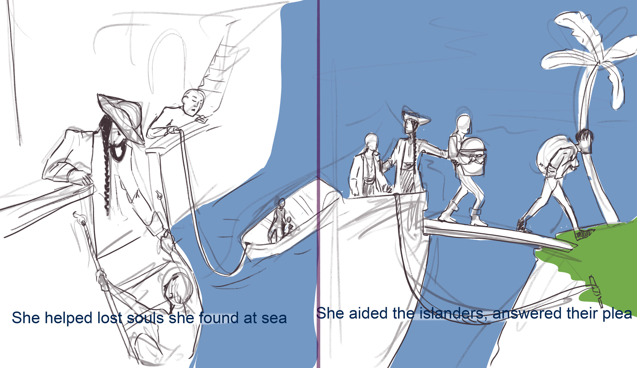
Help lost souls you find at sea
Aid the Islanders, answer their plea
Give up your title-
If you want to be with me”
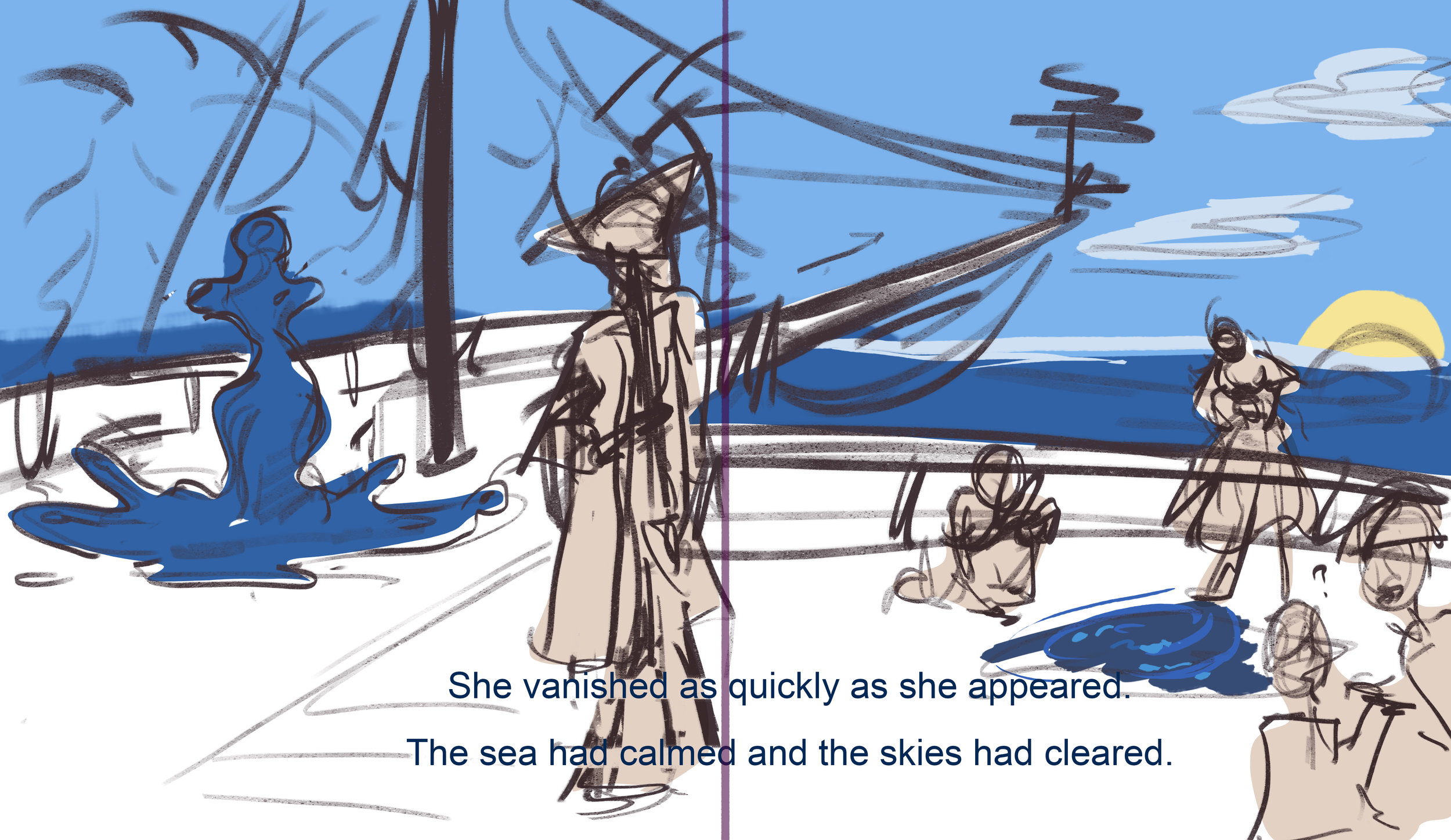
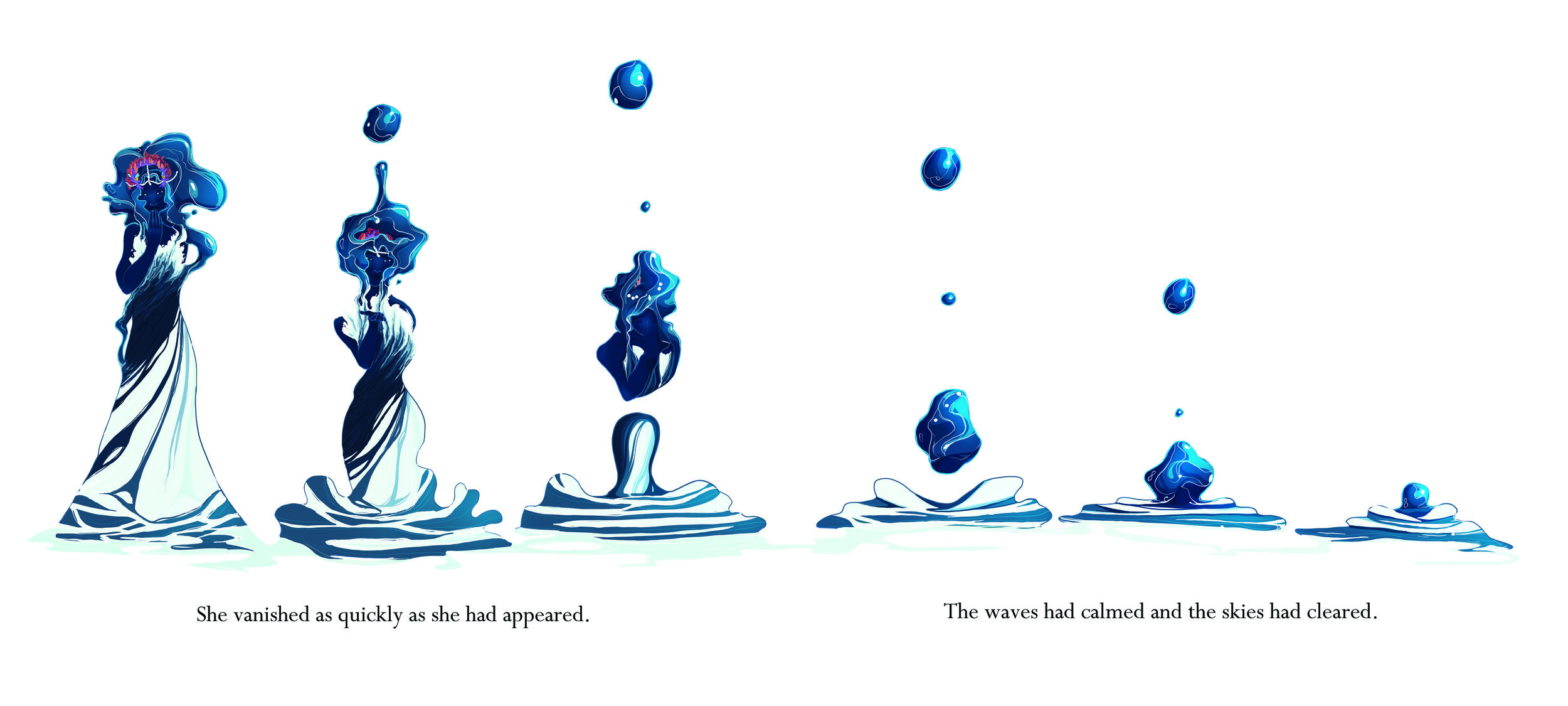
She vanished as quickly as she had appeared.
The waves had calmed and the skies had cleared.
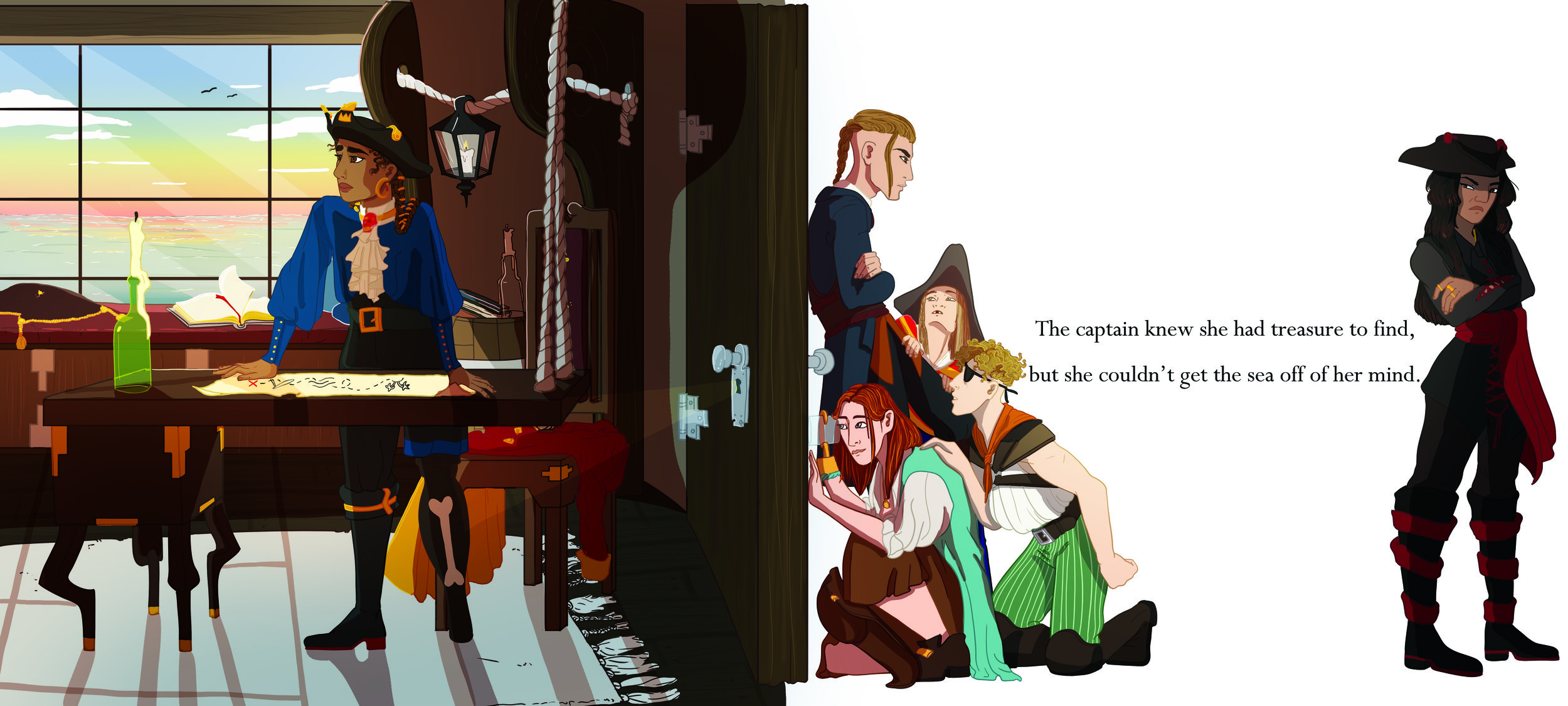
The captain knew she had treasure to find
But she couldn’t get the sea off of her mind
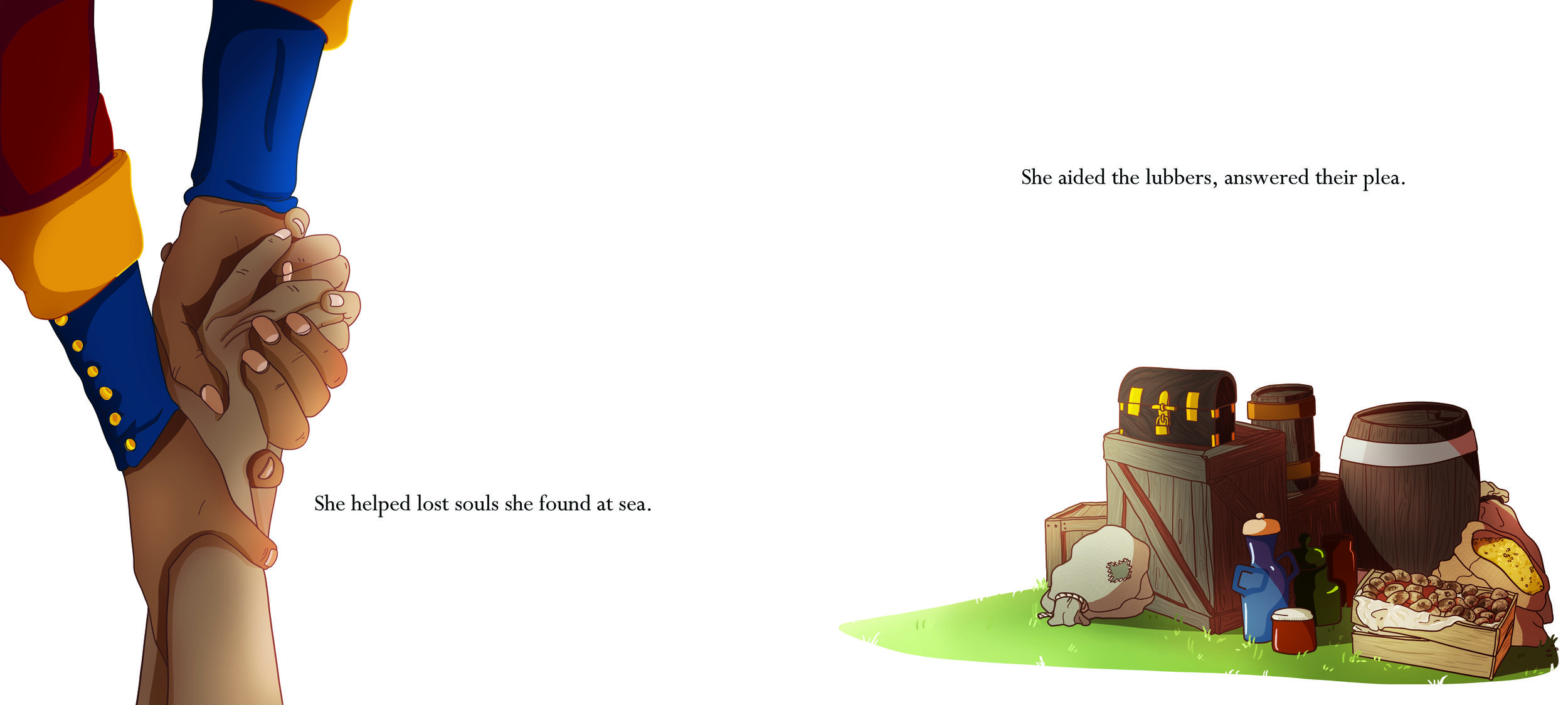
She helped lost souls she found at sea
She aided the lubbers, answered their plea
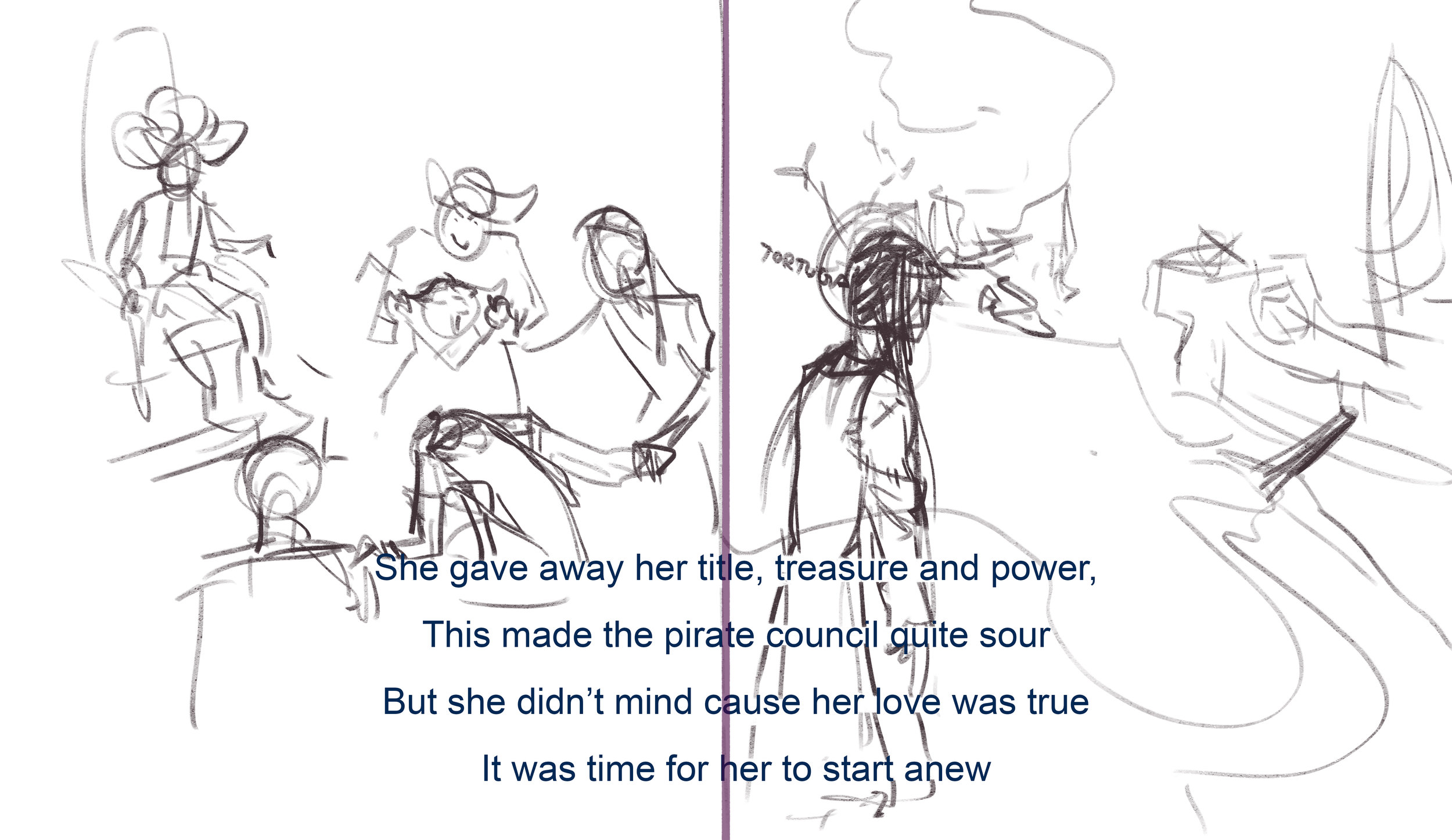
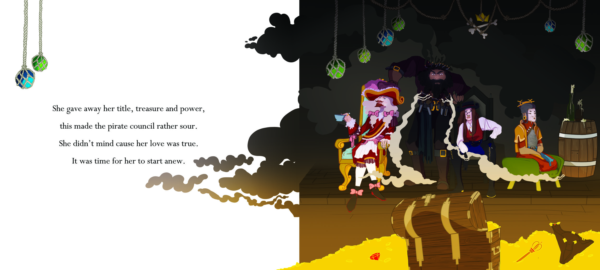
She gave away her title, treasure and power,
This made the pirate council rather sour
She didn’t mind because her love was true
It was time for her to start anew
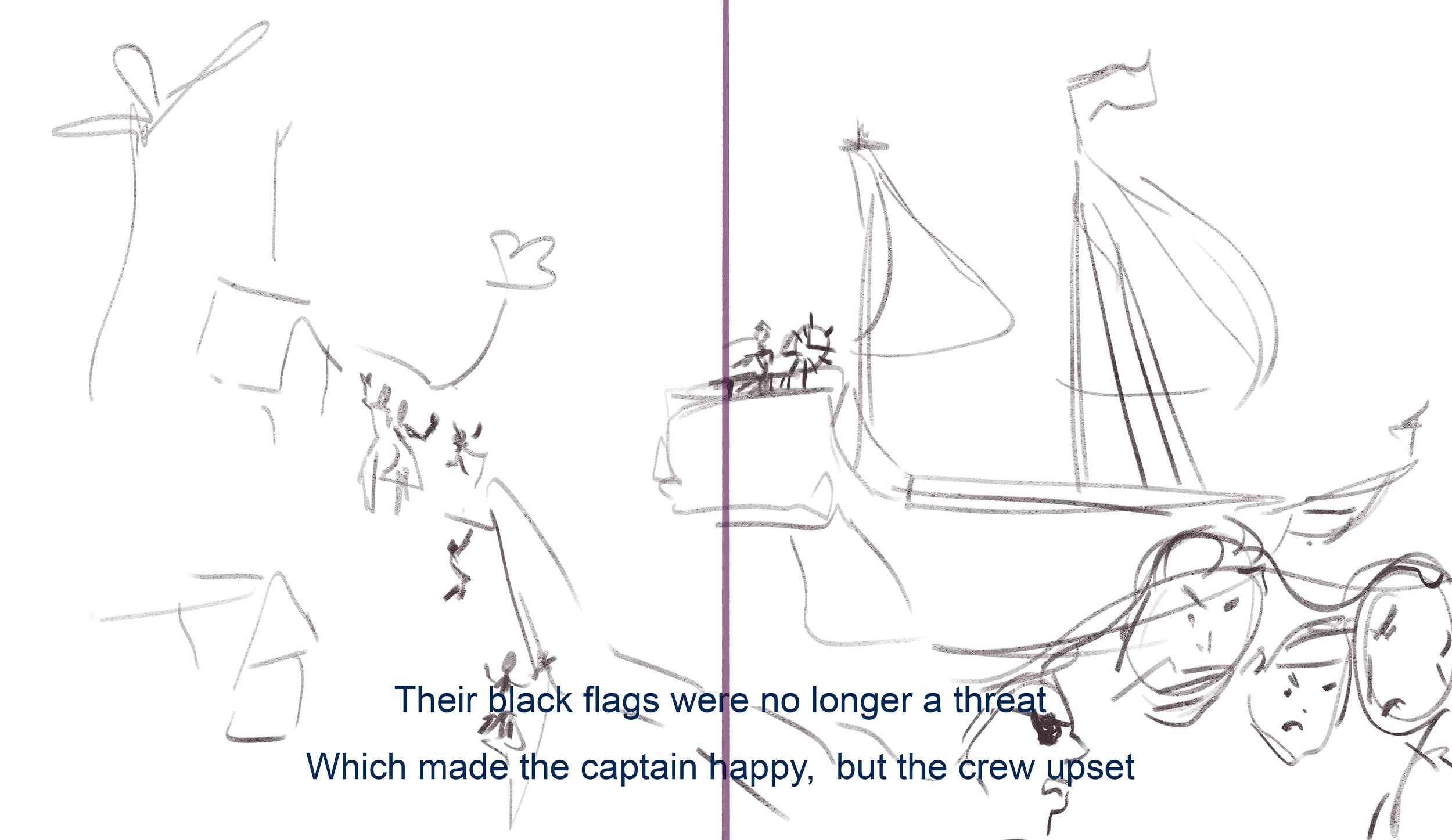
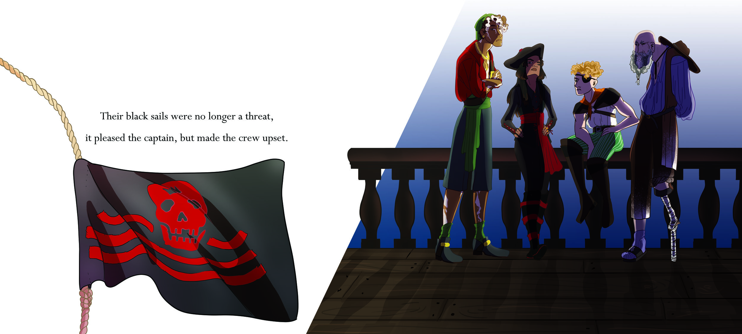
Their black sails were no longer a threat
It pleased the captain, but made the crew upset
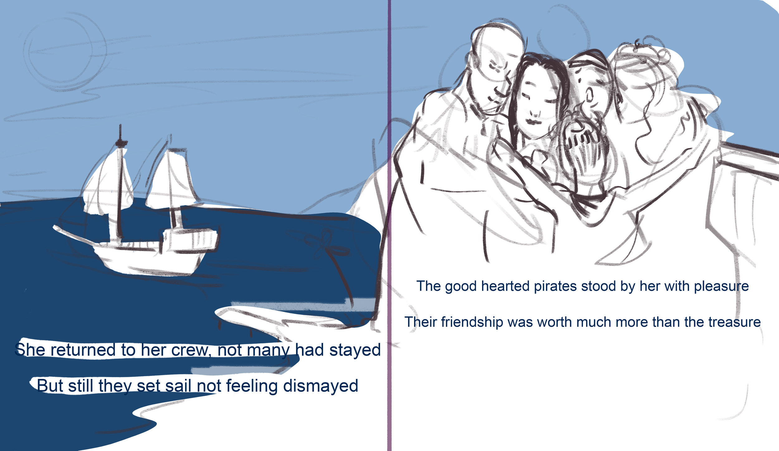
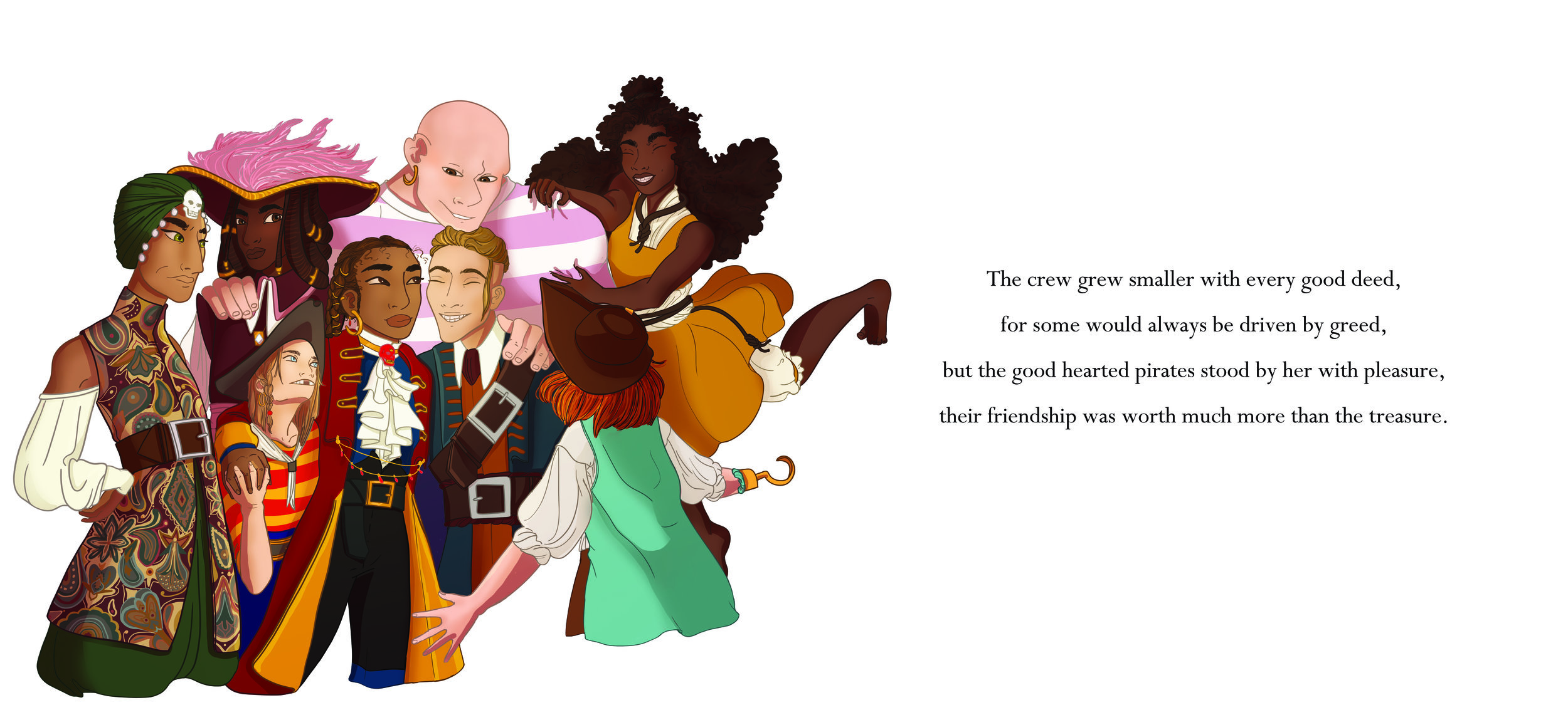
The crew grew smaller with every good deed
For some would always be driven by greed
But the good-hearted pirates stood by her with pleasure
Their friendship was worth much more than the treasure
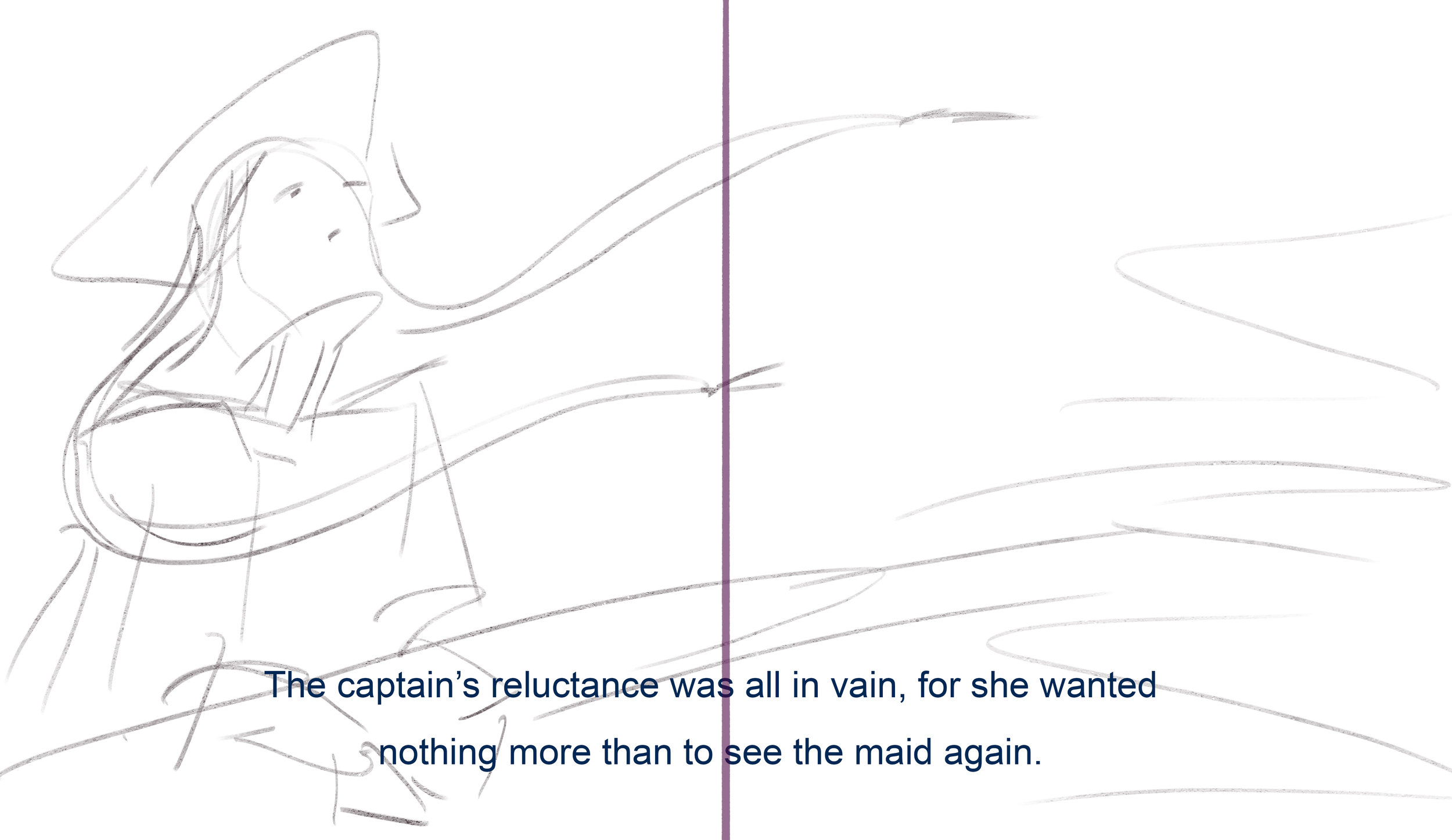
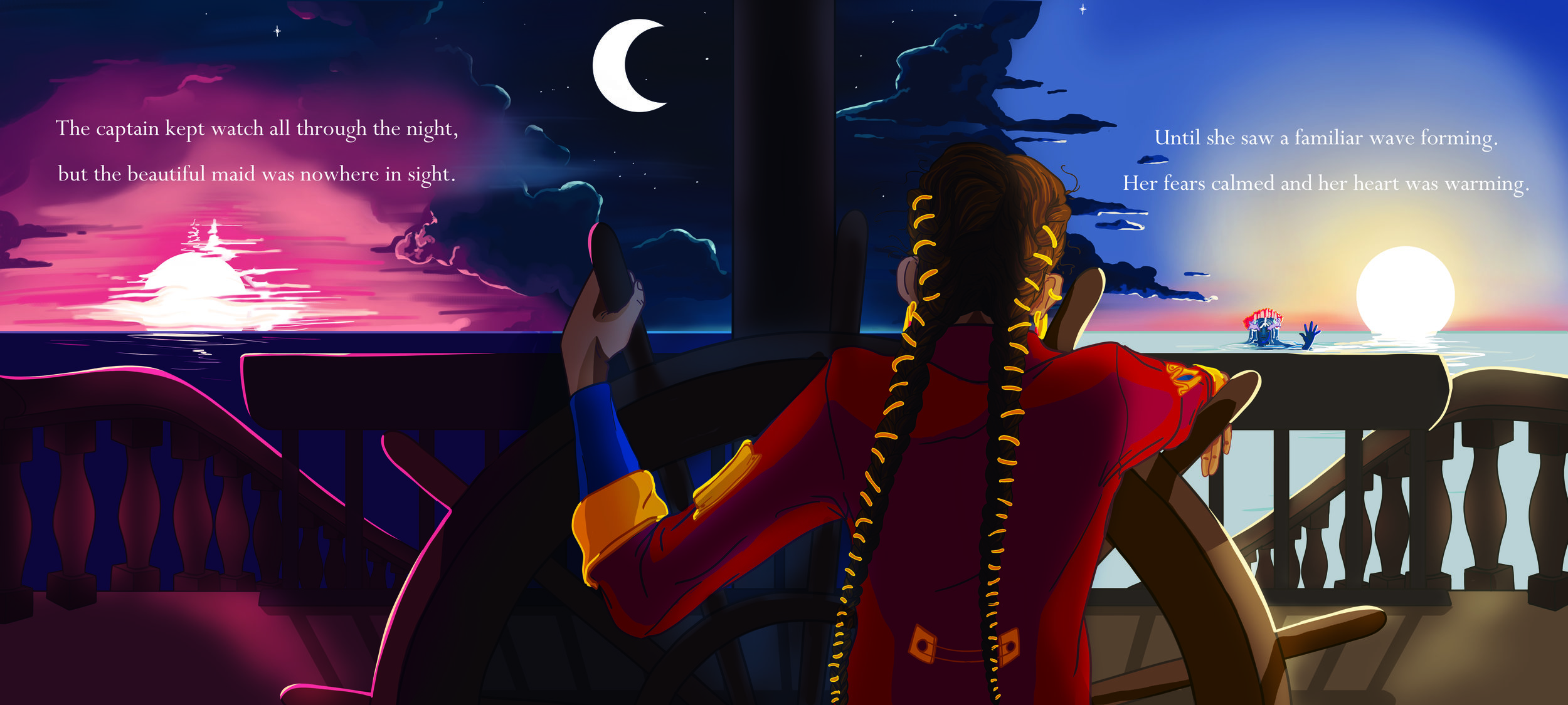
The captain kept watch all through the night,
But the beautiful maid was nowhere in sight.
Until she saw a familiar wave forming
Her fears calmed and her heart was warming
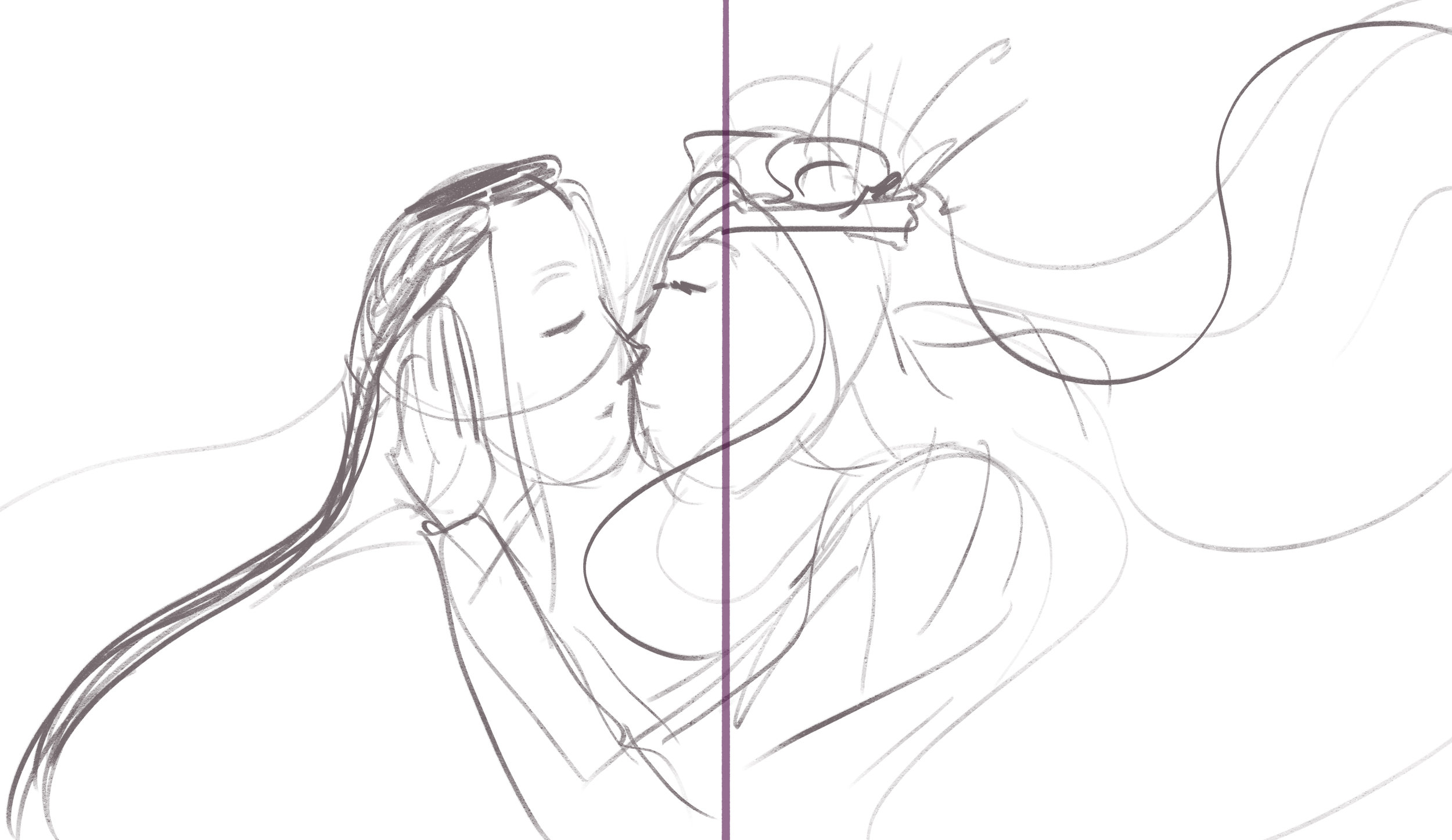
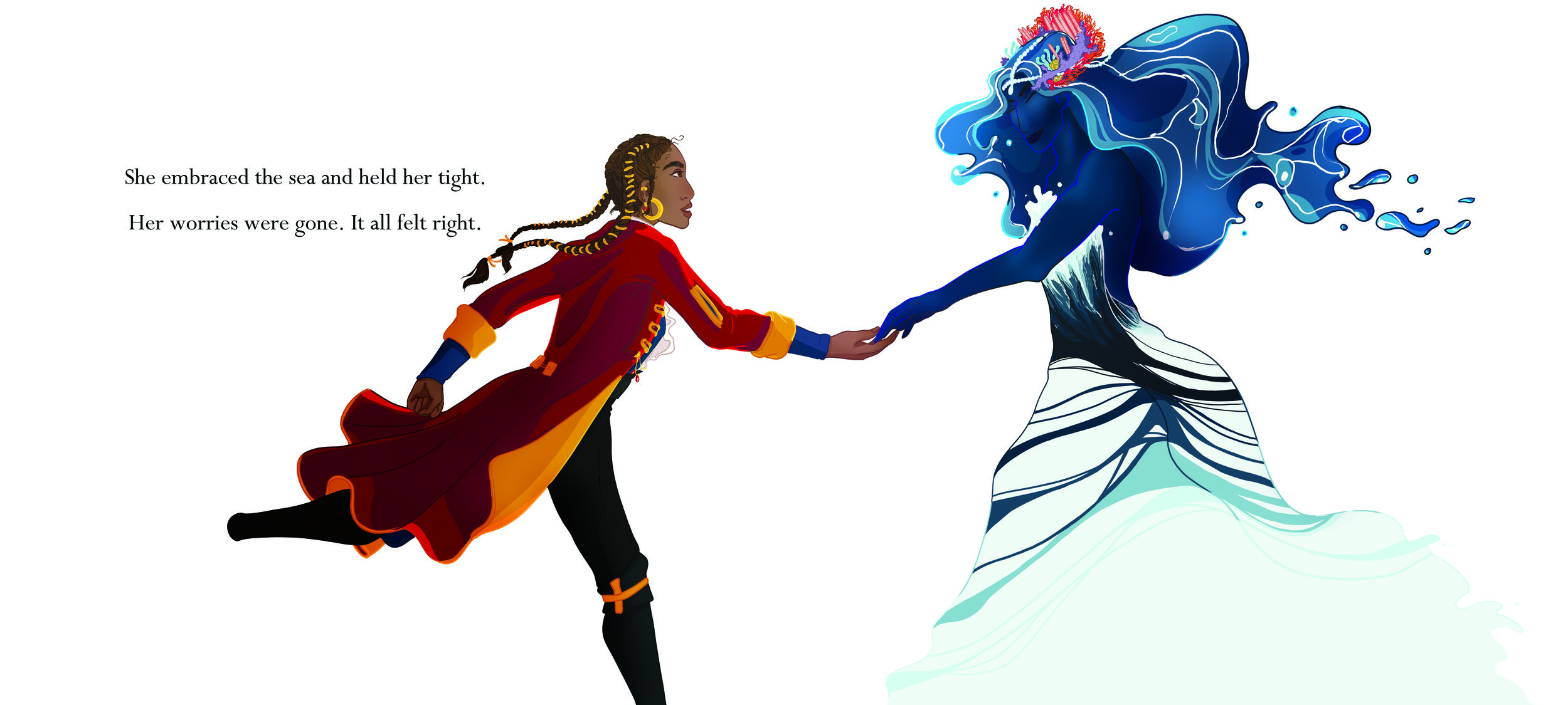
She embraced the sea and held her tight
Her worries were gone. It all felt right
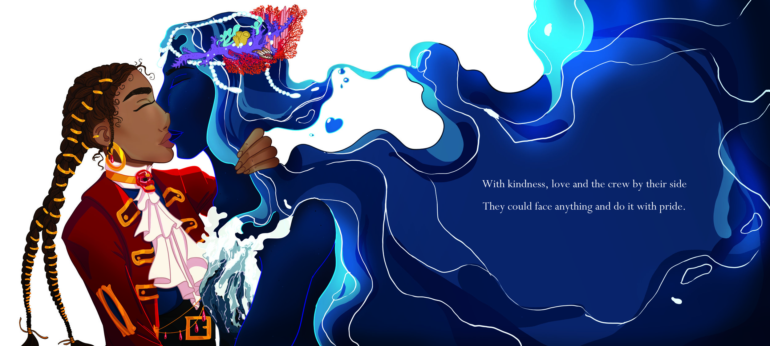
With kindness, love and the crew by their side
They could face anything and do it with pride
The End
Pre Production
The Story
A Classic Fairy Tale
The creation of “The Pirate Captain and The Sea” started with finding out what story I wanted to tell. The choice to base it on traditional fairy tales was made early. My main ambition was to create a book that felt classic but had themes and characters reflecting the modern society we live in. I felt this was best achieved by creating a story that conforms to the regular conventions of fairy tales and evokes a sense of familiarity in its structure and narrative progression. The reason I deliberately sought after something that could almost be described as a cliche was that I knew the characters and subject matter would be provocative. By having a classical structure with a modern and diverse theme it helps make the book approachable. Had I written an unconventional storyline and message, it would have been easy to dismiss the book as a niche project. My intention, however, was to achieve the broadest possible appeal. I would find tropes and conventions within fairy tales and children’s books and see how I could use and adapt them to my project in order to create something that feels unmistakably like a children’s book.
The final story is about a ruthless pirate Captain whom, during a terrible storm, meets the god of the sea, manifested as a woman. The Sea charges the Captain with three tasks. Through these tasks, The Captain becomes a better person and upon completing the tasks, she and The Sea can live happily ever after. A detailed description of the different script ideas I considered, before landing on the final version can be seen in my portfolio under Script: Ideas. The basis for the love story between The Sea and The Captain is inspired by the saying “I am married to my job”, but tweaked to fit a pirate scenario, “I am married to the sea”. I have heard this saying be used by sailors, however, I could not find a definite source confirming that.
Fairy tales, although diverse in narrative and theme, usually follow the same conventions. There are already a plethora of fairy tale conventions present in the outline of the story and with the further development of the script, the story was moulded to fit the genre specifics even more. To see earlier iterations of the script and to get a better look at the step by step process of refining it, please see the Script: Script Iterations tab of my portfolio.
One of the main aspects of a fairytale is that there is a moral to the story. Fairy tales were traditionally and still are, used as a way to educate children in an interesting way. By baking a moral into a story it keeps the listener, or reader interested while still learning. Through the characters and situations presented in the work, one can remove oneself from real-world consequences and focus on the lesson the story is trying to teach. “The Pirate Captain and The Seas” is a story that aims to teach people about selflessness, and how love and loyalty find those who are kind. This is illustrated through the Captain and the tasks she completes. The “reward” is the love from The Sea, but also the loyalty of the crew who stays even if she changes. Fairy tales will also almost always have an element of good versus evil, and the good triumphing over the evil and there ultimately being a happy ending. Although there is no direct villain in this story, the Pirate Captain is her own source of evil. The battle between good and evil is within the Captain herself and in the end, you see her defeat the evil inside her. There are outwardly bad characters such as the crew who leaves her and the pirate council that judge her, but they are merely a reflection of the captain's past. They are the version of the Captain that didn’t change and are still “driven by greed”. Other fairy tale conventions often dictate specific literary devices that are commonly used to structure the narrative. Amongst those are the use of an opening line that usually is either “Once upon a time,” “Long ago,” or “Once there was a …”. There is also a common use of numbers like three or seven, examples being Snow White’s Seven Dwarfs or Goldilocks’ Three Bears. The use of three and a conventional opening line can be seen in “The Pirate Captain and The Sea”. The Sea issues three tasks to the Captain and the book starts with the line “There once was a pirate captain, more fearsome than all, “. Furthermore, the use of repetition is very prevalent in fairy tales as it creates a rhythm and makes it easier to remember. Early fairy tales were traditionally told orally, the Brothers Grimm were amongst the first to write down the oral folk tale. The fairy tale is a subgenre of the overarching term, folk tale. Other genre conventions are related to the setting in which fairy tales usually take place. A fairy tale often features imaginary character and creatures, they are commonly set in a distant or fictional land. They will often have elements of magic, either in the form of wishes, magic power or magic items. “The Pirate Captain and The Sea” have overtly magical features, mostly in the form of The Sea and how she is able to control water and magically manifest through it. The story itself is in line with the conventions of a fairy tale and with the happy ending of The Captain and The Sea ending up together it drives home that this is a fairy tale love story.
Story Setting and Themes
Looking at the story itself it can clearly be seen as a fairy tale, but many conventional fairy tales are about princes and princesses. If I intended to create a story that felt classic and distinctly fairy tale like, should I not have set it within a medieval world with the characters reflecting these tropes? If the sole purpose was to make a conventional fairy tale then that might be the best approach. But as an artist, I don’t enjoy limiting myself to the expected. I also knew I wanted to challenge the perception of what boys and girls like. Thus, when choosing the situation in which the story would take place I landed on pirates. I will in broad terms discuss this choice and how it affected the project, for a more detailed look at the research leading up to this choice and what followed, please go to the Research: Why tab in my portfolio.
Gender and Sexuality within the Narrative
Since the inception of the project, I had decided that the main characters would be female. As a woman myself, I feel more at liberty to tell a story representing queer women. I know what representation I would want to see and can tailor the story and characters to fit something I think reflects positively upon the female/female presenting members of the LGBT community. On the other hand, it could be considered presumptuous if I, a bisexual woman, wrote a story detailing, for example, a male homosexual experience. Although, I am not against this, and do not think all media needs to be produced by people who match that identity, be it race, sexuality or gender. I do, however, recognize the benefit of it. I also think that by telling a story that is closer in line with my own identity it becomes a better reflection of myself as an artist. This was one of my motivations for creating this project. I wanted my final major project to be something of a culmination of who I have become as a person and the voice I have as an artist.
Whilst there is little research explicitly stating that pirates are a “boys” thing we can commonly agree that it is a theme that has been commonly catered towards boys. There might be one token female character to balance the roster out, but on average it is mainly male characters presented for a boy audience, be that in film/TV, books or toys. We have seen this gradually change, as books like the “Jolley-Rogers” series become popularized. It is important to note that the representation of female characters within a pirate setting is in some ways a tall order. Because, historically, women were not allowed to be pirates or even be on a pirate ship. However, one could say the same for knights. Women weren’t historically allowed to be knights, but we see more and more representation of female knights or warriors. But much as we have stories of women being knights, be it in a European context or, like Mulan, in China, we have stories of women being pirates. For more information about the most famous male and female pirates please refer to my Portfolio under Research: Pirate Research. So, why do we not have a more modern representation of women as pirates? Maybe pirates aren’t a popular enough subject matter to warrant the effort of representation. However, I aim to change this. I wanted the book to appeal to both genders. I felt that if I set it in a more generic fairy tale setting, meaning princesses and knights, it could easily become a “gendered” book. If I had two female knights or two princesses, the audience will quickly become girlish. But more importantly, this has been done many times. In the last year, multiple LGBT children’s books have been published set within a medieval setting. “Prince and Knight” published in 2018 is about a prince and a knight falling in love, and “Princess Princess Ever After” published in 2016 is about a princess and a knight falling in love. Thus, in the small market which is LGBT+ children’s books, the medieval storyline is already fairly saturated. I wanted to create something that had not already been done multiple times. Thus I settled on pirates, as they have similarly rich ties to history and are also a commonly used theme in children's media. Additionally, I think it is a subject matter that can be made appealing to both boys and girls. If one assumes that pirates are a “boys thing”, then there is already a basis for appeal thereby having women as lead characters there becomes an appeal for girls as well.
I also want to quickly state that one of the best selling sub-groups of children’s books are the ones about animals. From a monetary perspective, this might have been a more “successful” choice. However, this market is fully saturated and furthermore, I did not want my book to blend into the background. Additionally, if I made this story using animals instead of humans I feel that it would, in a way, be censoring myself. Because it would be distancing the story from the human element of the LGBT experience, and although I want the book to be child-friendly I also want it to be explicitly queer. By that, I mean that there would be no way of “misunderstanding” the queer elements of the story. Although the story is not about being gay, it does have overt homosexual themes.
This idea of not censoring myself was very important to me. I had a brief debate with myself about whether or not I should have the Captain and The Sea kiss at the end. In books such as “Prince and Knight”, they do not kiss. Thus, I was concerned that a kiss might be too explicit for a children’s book, however, upon debating the issue further I decided that it was not. As a child, one sees kisses everywhere, not only between one’s parents but also in TV and film. The idea of “true love’s kiss” is introduced very early. I recognise that the reason stories with LGBT characters often avoid kisses is due to the increased chance of censorship. An example of this was seen in the Nickelodeon show “Legend of Korra” where the main couple was confirmed to be gay, but they were only allowed to illustrate this through them holding hands. It is good that these characters and stories are confirmed to be gay and one should be happy about anything that is a step in the right direction. However, I find the trend of hinting at queer relationships rather than explicitly showing contrary to the point of representation. If a child is allowed to see heterosexual couples kissing I see no reason why they shouldn’t be the same for homosexual couples. I felt it would not be true to my intentions if I censor myself to appease potential critics. Thus, I made the choice to have my character kiss, because it is a tender moment between two loving and consenting parties.
Snow White and the Seven Dwarves (1937)
Frozen (2013)
Pirates as a Cultural Setting
In relation to the choice of pirates as the context for the story, I felt pirates were the perfect catalyst for the story. Piracy was at its height during the Golden Age of Piracy from 1650 to 1720. They were in many cases navy sailors who had deserted to seek a life of freedom and riches as Pirates. As I explain in my portfolio under Research: Pirate Research: Cool Facts about Pirates
“The British Empire was almost at its largest [during the Golden Age of Piracy]. Which meant they had their hands in Africa and Asia as well as the majority of Europe and the West Indies. Thus, the British fleet itself was quite international in its make up, meaning that deserters from the fleet (which there were many of) had the likely chance of being from pretty much anywhere in the world. In addition, The New World pirates, which are the pirates in the Caribbean and surrounding areas, were heavily dominated by the Spanish, and if you pair that with the ethnicity of the local inhabitants, you get a very motley crew of different ethnic backgrounds.”
It is within this motley crew that our story is set. With pirates already being a diverse group, they become a great stage for modern representation as it ties into their historical diversity, however, I have altered and updated to fit the representation we need today.
The Characters
The characters are the main source of diversity, with pirates historically being such a diverse crowd I had liberty in what ethnicity they could be. Additionally, since the world in which the story is set is a world without prejudice, I could allow female pirates. There are 19 characters in the book, and the process of designing each of them is detailed in my Portfolio under Design: Concept Art. I will not be discussing the design choices related to the characters in this text, rather I will focus more on whether or not the design process was successful, and how I could adjust my approach later. This will base itself on the research and experimentation carried out in my portfolio so please refer to that to get a better understanding of the work I have carried out to be able to come to this conclusion.
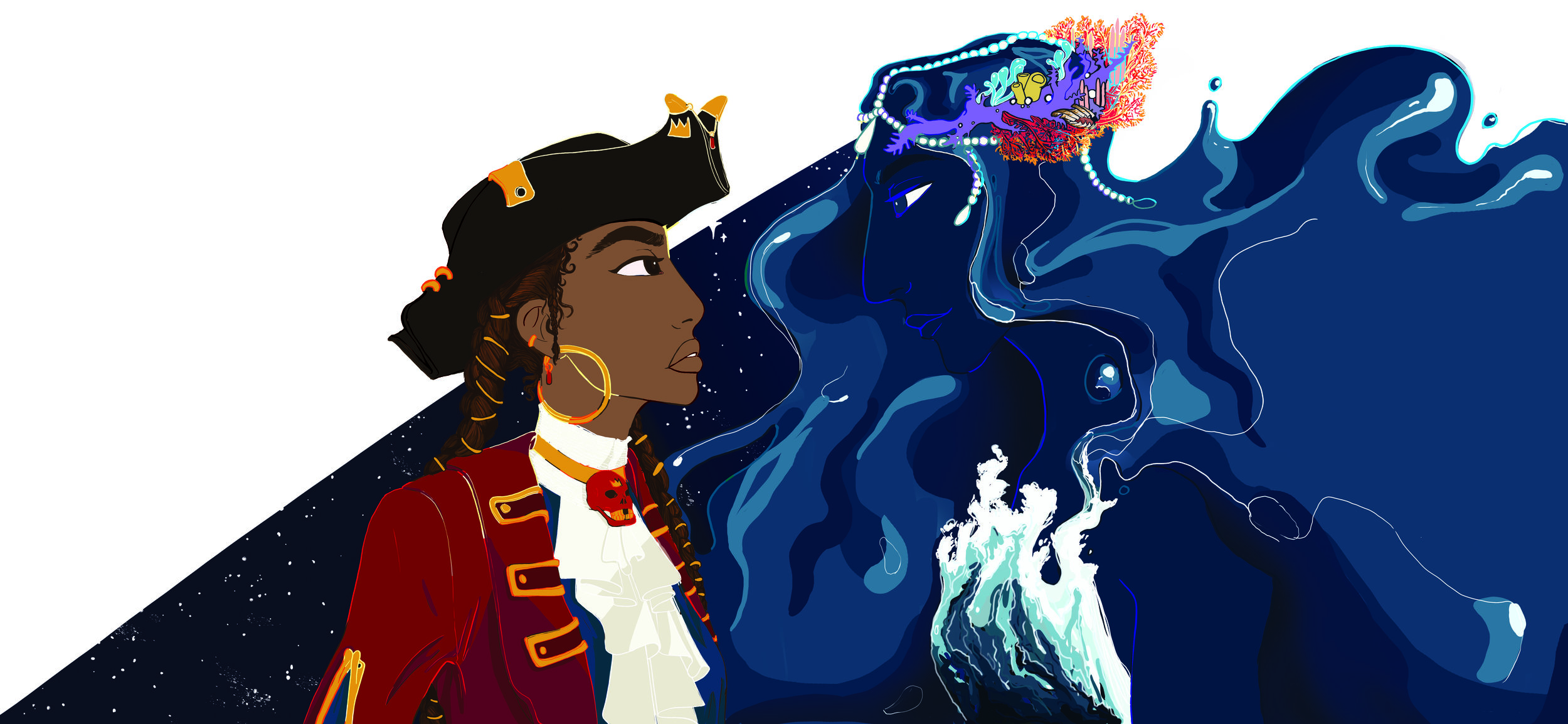
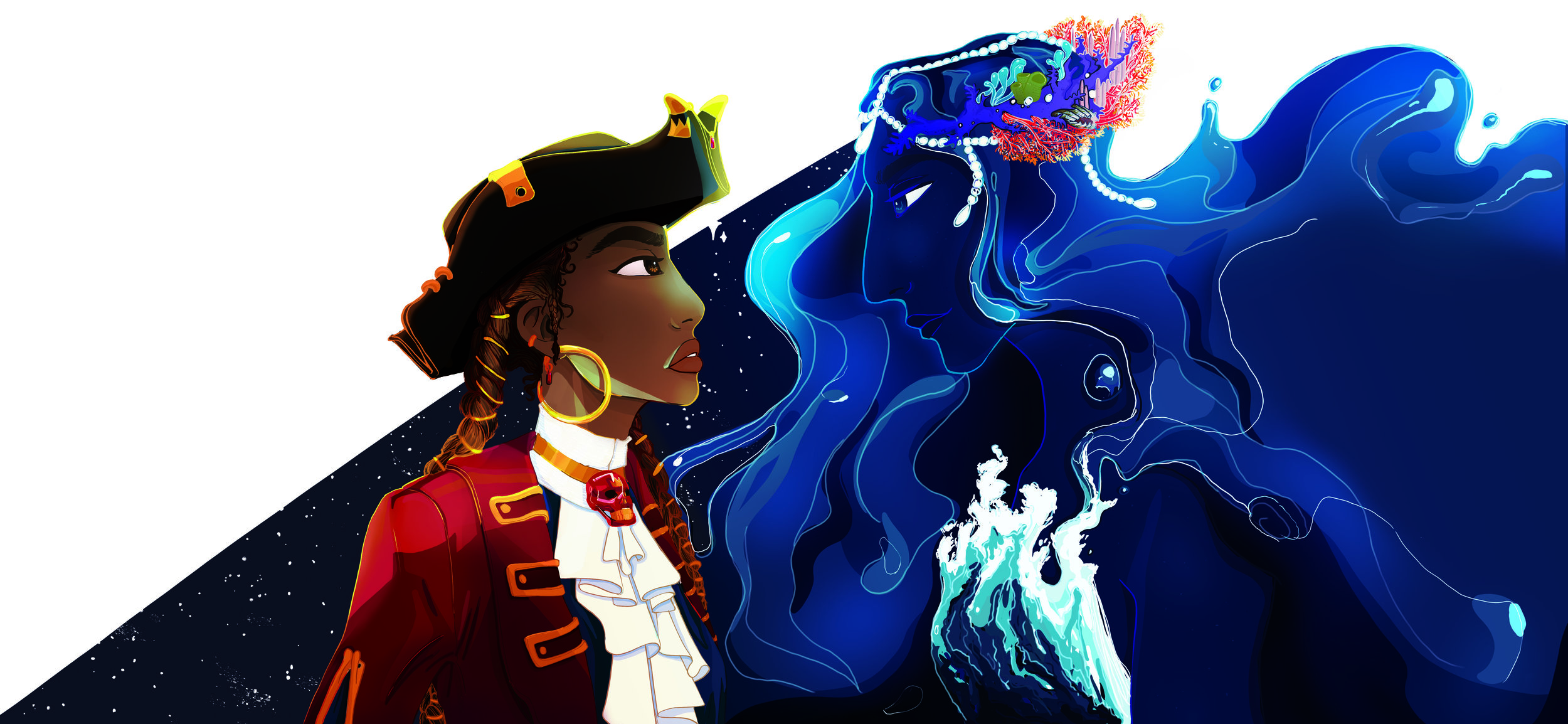
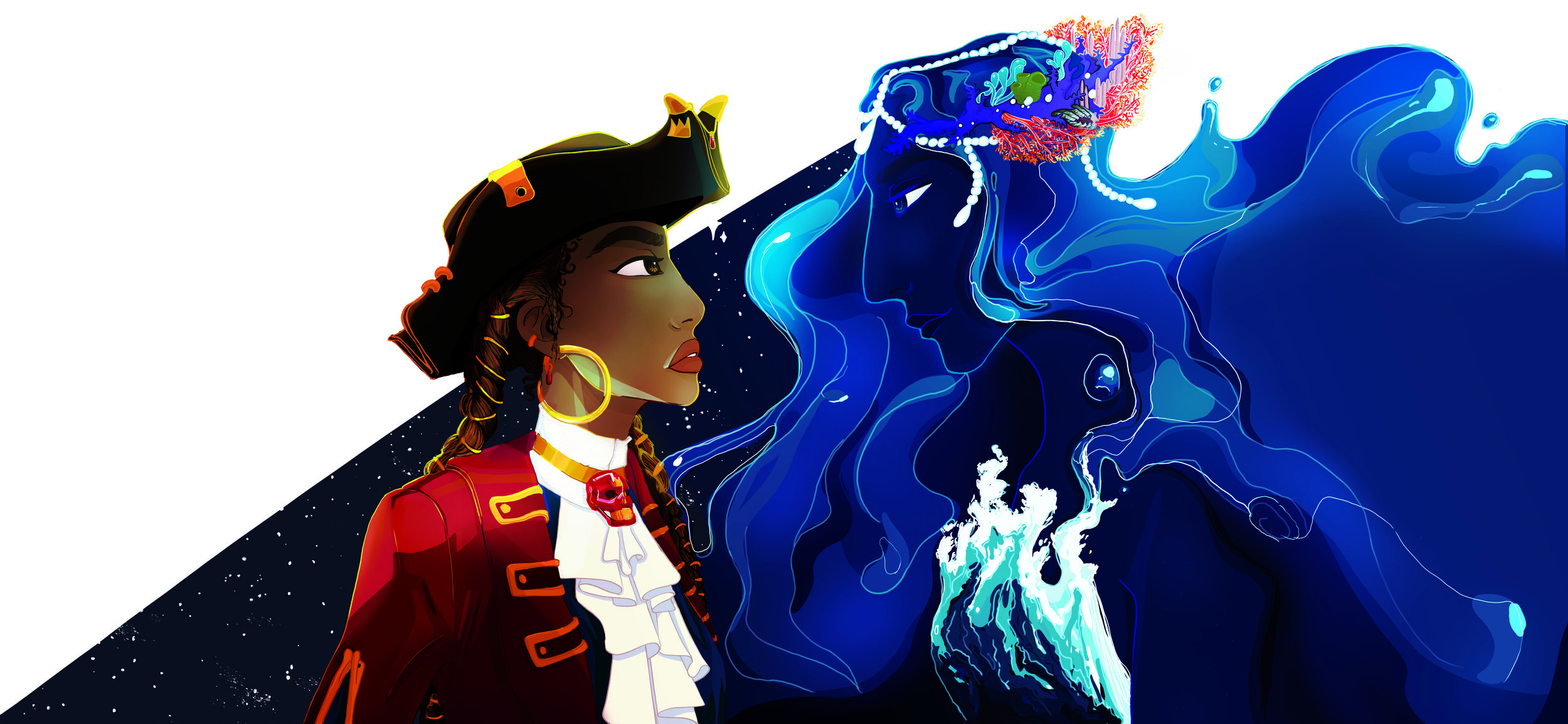
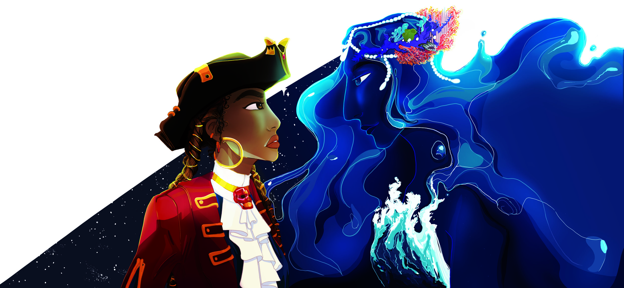
The Captain and The Sea
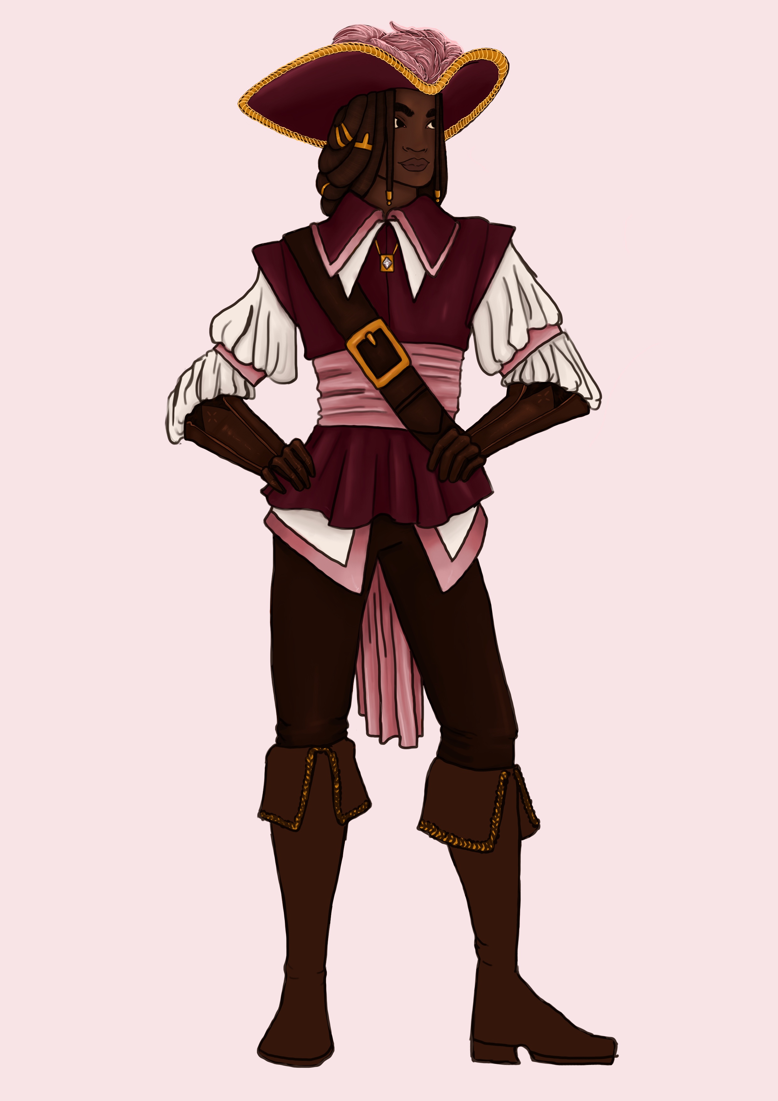
This project as a whole was characterized by spending too much time in pre-production. The majority of this was spent on designing the Captain and The Sea. These being the title characters, it is reasonable that the most time should go into their design. However, I was plagued by an inability to make decisive choices. I would constantly question myself and be stuck in circles concerning my design decisions. A good example of this is the Captain’s hair. I had originally intended for her to have short hair, as there is an appalling lack of female characters with short hair. Speaking from personal experience I have met a lot of children that were confused about my gender just because I have short hair. Thus, I had personal reasons for wanting that representation. However, I deliberated that by giving the Captain short hair I may be enforcing the stereotype of lesbians having short hair. But by not giving her short hair I was contributing to conventional gender ideas of women having long hair. Thus I was stuck in this circle. I debated having her change her hair halfway, either by cutting it off or always having it tucked away and then at the end letting it down. But I didn’t like what any of these choices represented. Eventually, I chose to give her two long braids because they are functional, as in not being loose hair that can get caught in things. Whilst pirates are in many cases extravagant, they are most of all practical. This debate was one of the many decisions loops I was stuck in, and like I did with the hair, It reached a point where I needed to make a choice. However, this took longer than expected and whilst my original production plan called for the Captain’s character design being finalized in early November she was not done until mid-January. The same went for The Sea. She was a bigger challenge from a design point of view because finding a way to represent something that is fictional and amorphous is much more difficult than designing a pirate where you have many references to build from. My biggest obstacle was my hesitation to draw water. Water is famously challenging to draw, and whilst it would make the most sense for her to be made of water, or have predominantly water elements, I did not want her design to rely on that because of the time it would take to draw. However, as I kept designing variations of her wearing clothes, it just did not feel right. In the end, I landed on a design that consists exclusively of water. I made the choice that I would rather have her accurately represent my vision rather than skimp on the details only because I was intimidated of drawing water. One of my ambitions with this project was to challenge my illustration abilities and by incorporating many water elements I definitely achieved that goal.

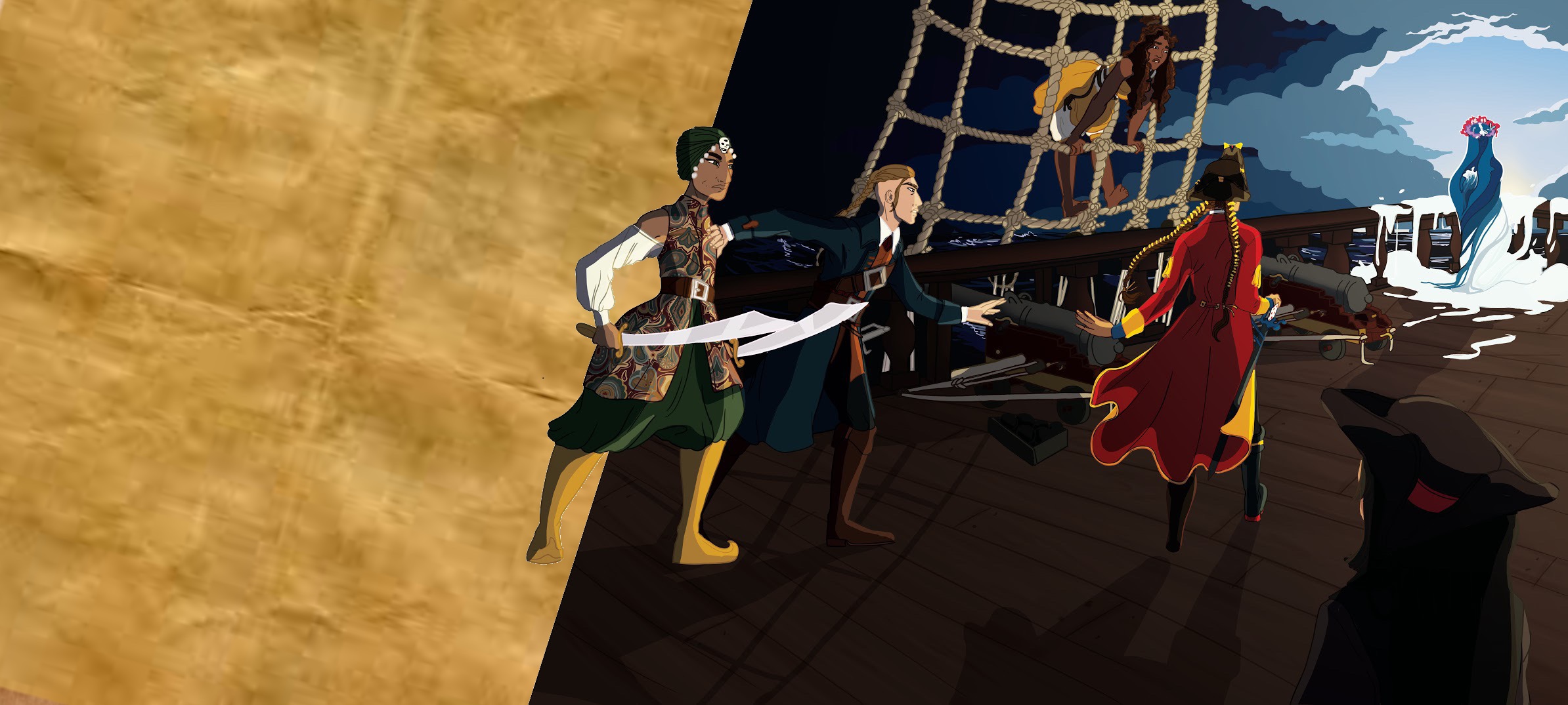
The Crew and Council
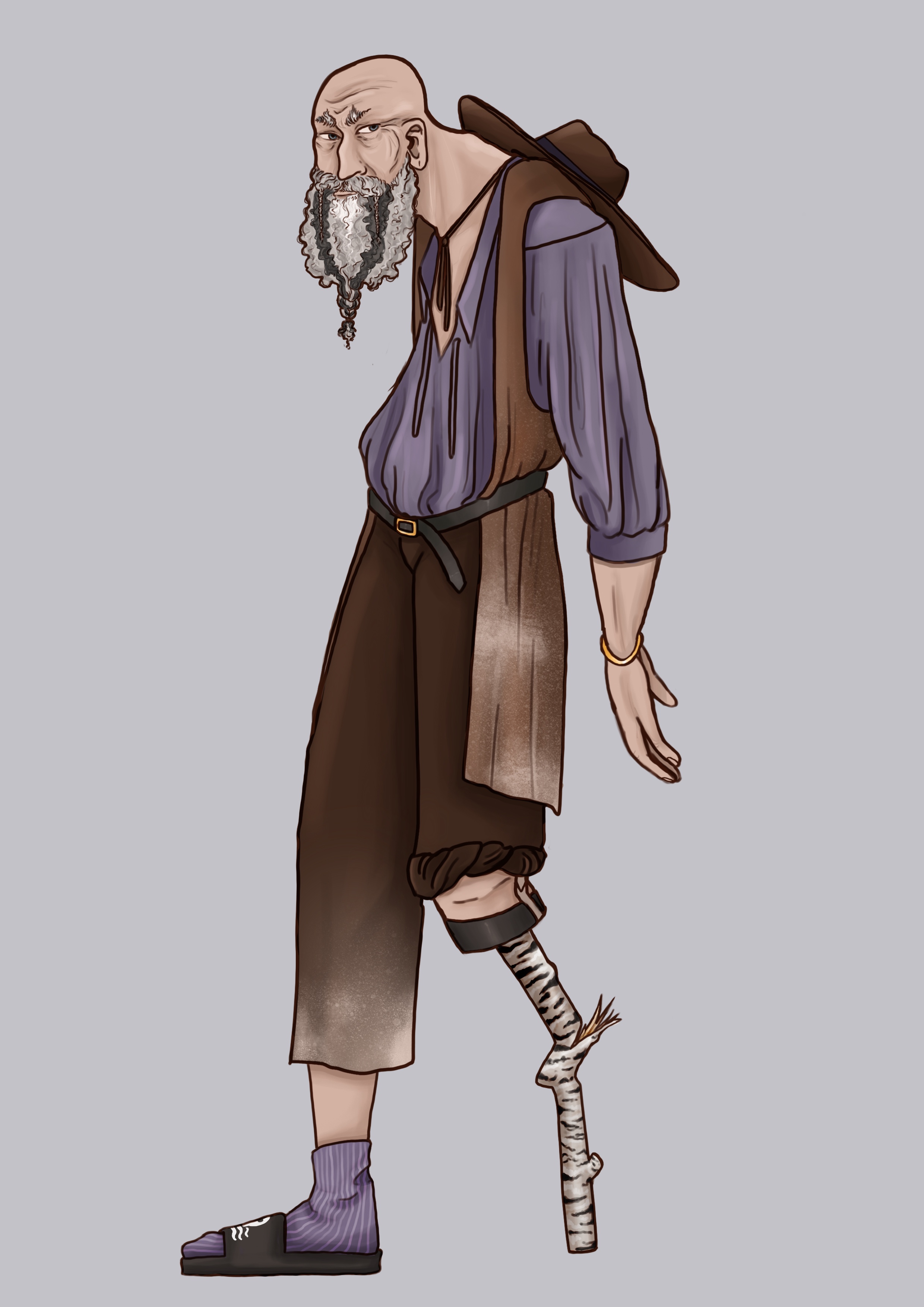
Since the design of the Captain and The Sea took so much longer than expected, It affected the time I had available to spend on the crew and pirate council. Whilst The Sea and the Captain had a very long and detailed design process, the council and crew were relatively rushed. With them, I did not question myself as much as I did with the main characters, which meant I could produce more characters, faster. In many cases, I would figure out the designs as I was drawing them.
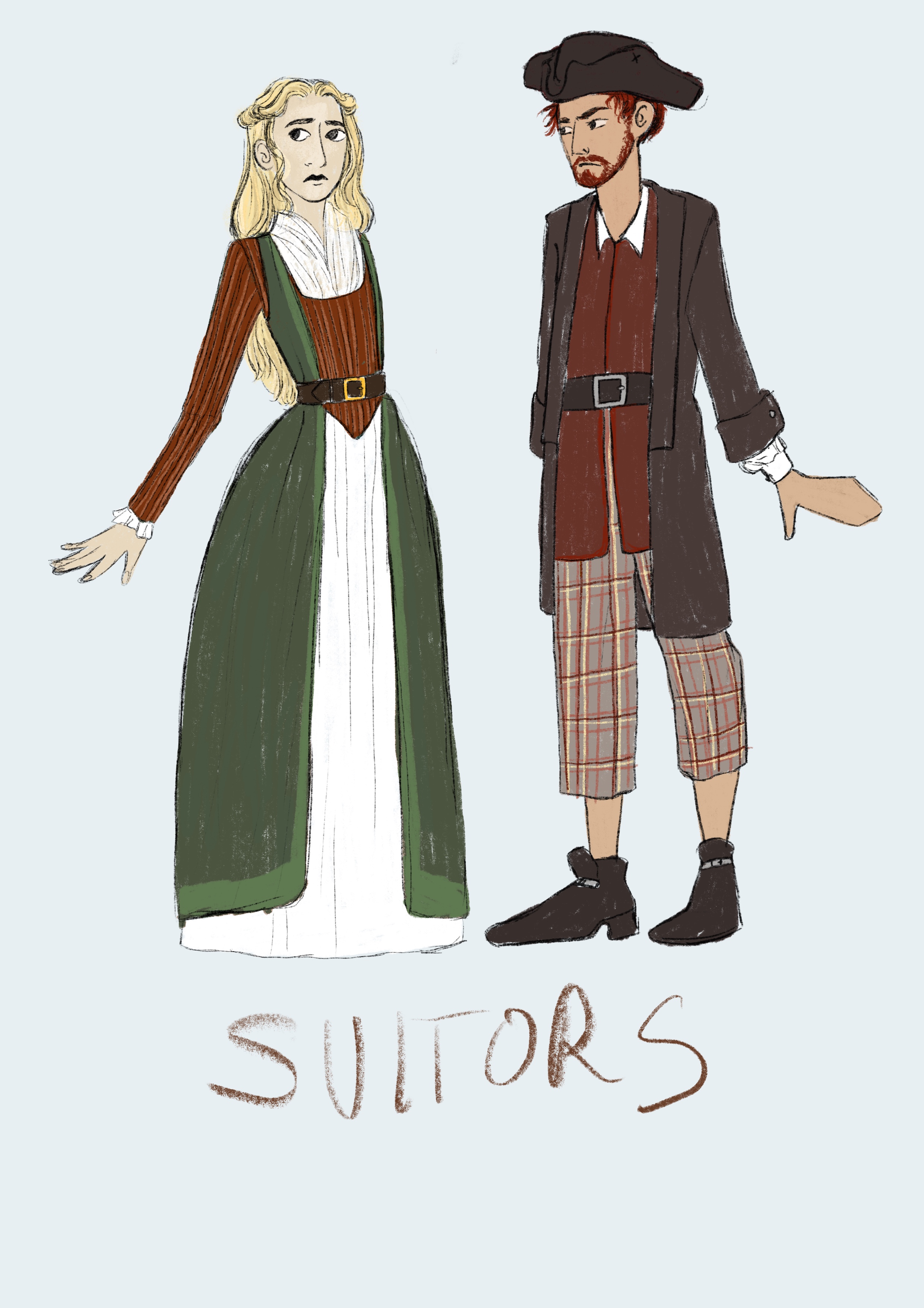
This video is, very reflective of the process I went through for most of the character. It is important to note that I had done some research into what I wanted the crew to look like, so I had a pretty good base to work from. But the finalization of their appearance was all designed in the trial-and-error way you see in the video. For this crew member, Clement, specifically I had originally wanted him to wear a more traditional African dress, based on the Bombay Pirates, you can see references to this in my Portfolio under Research: Pirate Research. Then as I could not get a good grasp of the design I decided to explore alternatives. I briefly explored maybe taking the character in a Native American direction, but decided not to as that would derive a lot more research which I did not have time for at that point. In the end, I chose to look at more European fashion. I imagined him being tired of his humble lifestyle and making the choice to become a pirate. Now with the gold he gains from his exploits he spends it all on the finest clothes from European tailors.


Page Layout
Art Style
With the story and characters written and designed, it was a matter of how to best approach the illustration style. At the start of this project, I had been conflicted about what style I should draw in. Like most artists, I have my own style that I draw in by default but have the ability to change and adapt my style to better portray a character or story. Originally, I had intended to create a new style that felt more suitable to a children’s book. The reason I didn’t feel that my style fit the project was that it can come across as quite modern and adult, with clean lines and semi-realistic proportions. It doesn’t have that element of whimsical fun that is common in many children’s books. My pipeline became more and more delayed, but I still felt adamant in exploring different styles, until a lecturer pointed out to me that this project is a reflection of me as an artist, thus the style should also be true to who I am. Although I think that creating a new style would still be representative of me as an artist, I appreciate the sentiment. It warmed me up to the idea of using my default style. Furthermore, the time in which it would take to craft a suitable new style and then follow it, would not only add extra work in the pre-production also during production. Using a style I am not comfortable with can quickly double the amount of time spent drafting and creating line art. These reasons in combination were enough to convince me to use my natural style. In my portfolio under Design: Visual Research, I go into more detail about the different styles I researched and explored.
Layout
Having chosen to pursue a style that comes naturally to me, there was little left to do other than start sketching the layout of the pages. All iterations of my page drafts are in my portfolio under Script: Page Drafts. To maximise the challenge this project would be for my illustration skills, my original drafts featured full-page illustrations with very detailed environments. The first drafts were focused on the environment because that is what I find the most challenging. However, as my pipeline was delayed further due to the time spent on designing characters I had to revise my page layouts to be able to complete the work in time.


A major trend within children’s book illustrations is the use of white space. Looking at famous books like “The Gruffalo”, “Green Eggs and Ham”, “Where the Wild Things Are” and newer books like “The Dinosaur that Pooped a Planet!” and “The Sniffles for Bear” all use blank spaces to break up their illustration. Some have full illustrations with white space for the text, like “Where the Wild Things Are”, and some have a more integrated approach. This way of structuring the illustrations was very interesting to me and seemed like a great way to maximize storytelling while minimizing the full page illustrations needed.
Thus, I reworked the page drafts, to compress each page into the bare minimum needed for the narrative to flow. I liked the integration between full illustrations and white space that you see in “Green Eggs and Ham” and “The Gruffalo”. It is more dynamic, with variations between full pages of colour and then small overlaying «cut out» images that Integrate with the text. Although I was minimizing the number of full-page illustrations, I still wanted to retain some as a way to break up the flow of the other pages and to be a testament to my original intentions of challenging my environment illustration skills. In the final draft, you will also see a bigger focus on the crew. They are a larger part of the illustrations, which I was pleased with since it created a bigger sense of kinship between the Captain and the Crew. They are also an important part of the narrative because they are the ones who represent the theme of loyalty vs. greed, which is one of the major morals of the story.
In the examples above you see that many of the books have a soft transition between the illustrated element and the white page. Either in the shape of a fade out, as seen in “The Gruffalo” or as in the example of “The Bear With the Sniffles”, where the use of soft watercolours functions as the fade itself. I decided on a more stylistic approach. Using harder edges and cleaner cuts, with some elements that bleed between the pages. I elected to use harder cuts in my divisions. Many children’s book illustrations have a fluid style with more use of textures and mixed media, however, since I draw digitally, my style is cleaner and with smoother line art. That is not to say that digitally produced art always has a flat and “digital” quality to it, though since I elected to use cell shading and relatively flat colours, it does have a stronger digital feel than had I used a different technique. Since the illustrations have this quality I wanted to compliment them by using harder divisions, as I felt using something more organic would go against the nature of the illustrations themselves. However, I did try to blend the transitions by having elements that cross over between the pages, thus making it more visually interesting than just hard cuts.
In getting feedback on the pages a concern was presented about the «whiteness of the pages». Referring to how brilliant the white in the empty spaces on the pages was. A suggestion was put forth in trying a different «background colour» or maybe having a parchment effect instead. In experimenting with different background colours and textures I experienced that more often than not it clashed with the actual illustration and washed out the colours. The reason I chose white, to begin with, was that when reading a book one assumes that the pages are white, thus by leaving those spaces «empty» it feels easier to ignore them and rather focus on the illustration. But by adding colour or texture to that space one brings more focus to all the empty elements on the page. Furthermore, I could not find a colour that felt suitable for all the pages and as most of the pages has blank spaces in them, I wanted a colour that would create consistency throughout. Although I recognize that I could have had different colours for each page, I asked myself what the purpose of that was as it did not contribute anything to the narrative. In addition, it took away the sharp contrast between the illustration and the blank page which was one of my main motivations for keeping the pages white. Therefore, I chose to keep the pages white. I saw little benefit in colouring the page’s blank spaces and as leaving the white of the pages exposed, is a normal children’s book practise, I felt this would keep my book in line with the conventions of picture book illustrations.


Font
The final element of the book’s layout was the font. I am not a typographist and although I briefly contemplated creating my own font that idea was quickly scrapped as I had to focus my energy on actually creating the book illustrations. Most children’s books use a serif font, likely because they have a more traditional feel to them. As I have explained I wanted to create a book that feels like a classic children’s fairy tale, and in doing so I also aimed to stay true to the layout of picture books. Of course with a genre as «fun» as children’s books, there aren’t any set rules for what you can and can’t do, however, by looking at different books you can glean what the most popular trends are. When looking at the font you see a dominant amount of serif fonts, you can see this evidenced in the pages pictured above. However, there are many serifed fonts to choose from. To see them in contrast with each other I set up a document with all the default fonts within the Adobe packages. I had chosen not to source fonts online as this can sometimes lead to copyright issues and as I am planning to commercialize this project, I did not want to run into any legal issues. Since Adobe’s fonts allow for both personal and commercial use it was simply easier to use those.(Adobe.com., 2019) In the exploration of the fonts, I gravitated towards the fonts that had a tighter kern. These felt less sterile than famous fonts like Times New Roman. In the end, I landed in Perpetua as it had a strong kern and was relatively small in size. The small size was important to me as my prose consisted of some long sentences that needed to fit on the page without breaking up the couplets. I had run into some issues with the sentences not fitting in the empty space properly and having to be positioned very close to the illustrations. Thus, the more condensed font the better, and Perpetua fulfilled those conditions.
A suggestion was put forth to have a handwritten font. With my intentions of staying true to the conventions of picture book layout, this would hinder my project from standing out. Although having a handwritten font would make my project more unique and fit better with the pirate theme. I recognize the validity of this point, however, it was not true the goal of the product. My goal is to create a functional children’s book, that a parent and child can easily read. A book that evokes a sense of familiarity in its construction while having a progressive message of acceptance and love baked into it. Whilst I do not doubt my ability to make a truly creative children’s book, with a modern and unconventional approach to the font, the binding and the illustrations. I don’t think this is a product that would appeal to a broader market group. My book is already unconventional, its inclusivity and representation is what will make it stand out. I fear that by coupling the unconventional characters with the use of experimental construction methods, the book will be judged as a niche product and not reach the audience I intend. Although a handwritten font is by no means as extreme as I may be presenting it, it does tie into the dichotomy between art and commercial product. This project bridges both categories, thus I had to make sure my creative choices didn’t teeter the book too much to either side of the scale. Lastly, on a more practical note relating to the font choice, I am not confident in my own handwriting. I knew that creating a font I would be happy with would take me more time than I had available. Additionally, I felt that a handwritten font could create legibility issues. This was very important to me as I want the book to be accessible to both children and adults. I imagine a handwritten font would be more difficult for a young child to read, and more annoying for a tired parent to read as they’re putting their child to bed with a nighttime story.


Evaluation of Pre-Production
Pre-production as a whole was heavily affected by the delay in the concept art stage. The Captain and The Sea took much longer to design than any other character I have worked on. Although spending 4 months on designing the two titular characters is by no means exuberant, it is, however, too long for the tight time frame in which this project needed to be produced. Whilst this delay did affect the time I had to design the other characters in the story I don’t feel it affected their quality. The crew and the council are very representative of my original vision, and although I had to work quickly, I don’t feel like I compromised on the quality or diversity of the designs. This is due to my extensive research in the early stages of the project. The research gave me a good base to make educated decisions on which allowed me to work freely and efficiently. However, it is important to note that the main reason the design of the Captain and The Sea took so long was that I was questioning myself more than usual. This is the first time I have designed character that will be in a product meant for the entertainment and consumption of stranger, and I felt pressure to create something that had broad appeal. The fact that it was for children added further pressure on my design process. Usually, I feel confident in my own choices and I know what I want to achieve with a project, however, I was concerned that my work would not be suitable for children. That it wouldn’t be a character that they would like. This held me back for some time, yet as the time pressure became greater, I become more decisive enabling me to make most of my key design choices. This is also why I managed to work so freely on the crew and council because I was not held back by my own insecurities. This process was a huge learning experience for me, the pressure of creating a commercial product has made me more confident as an artist. This is something I will take with me moving forward. I will be more decisive in my choices and experiment more with my designs even if I feel pressured by myself, a client or employer. By not letting myself get stuck in loops of creative anxiety I can create more work and thus have more material to base my decisions on.
The delay in designing the characters was the main challenge with my pipeline and although I still managed to produce the most vital elements of the story, there were elements I needed to sacrifice. Mainly, the ship. I had wanted to spend more time designing the ship and getting a good sense of the space in which the majority of the story is set. However, as time constraints limited this, my goal going forward is to dedicate more time to these aspects. I wanted to explore every nook and cranny of the ship and experiment with how I can reflect pirates as historical figures. I also wanted to design the ship in a way that would best present the personality of the captain and the crew, to make it feel like their home and a character in its own right. Since I did not have time to do detailed designs of the ship, this meant I had to make it up as I started illustrating the first pages. I sacrificed my initial goal of having very detailed environments, focusing instead on keeping it simple and replicable. Although I don’t feel like it had a great negative impact on the book as a whole, I definitely felt that I lost a level of character and detail that I aspired to explore. This sacrifice could have been prevented if I had been better at keeping to my original schedule, see Research: Project Planning.
Production
Size
The production stage of an illustration based project is fairly straight forward. Once you have the character design and page layout established it is only a matter of actually drawing the final piece. Before I started drawing I had researched what page sizes are commonly used for children’s book illustrations and what size I should draw in to achieve the highest quality print without having any compression artefacts. It is suggested to draw in a format that is 25% bigger than your final output. (Ratterree, 2019) In terms of the format, I had landed on the book being 25cm wide and 22.5 cm tall. I knew I wanted it landscape because that format lends itself to full-page illustrations the best and in terms of the specific size it was just a matter of measuring two books I owned and getting a better feel for what I liked. I used «Prince and Knight» where the pages are 24.5 cm wide and 21 cm tall. I also used «Julian is a Mermaid» which is 25 cm wide and 23 cm tall. I liked the slightly squarer shape of «Julian is a mermaid» rather than the narrower layout of «Prince and Knight», however, I made mine slightly shorter than «Julian is a Mermaid» because I wanted a little more contrast between the height and width.
Time and Workflow
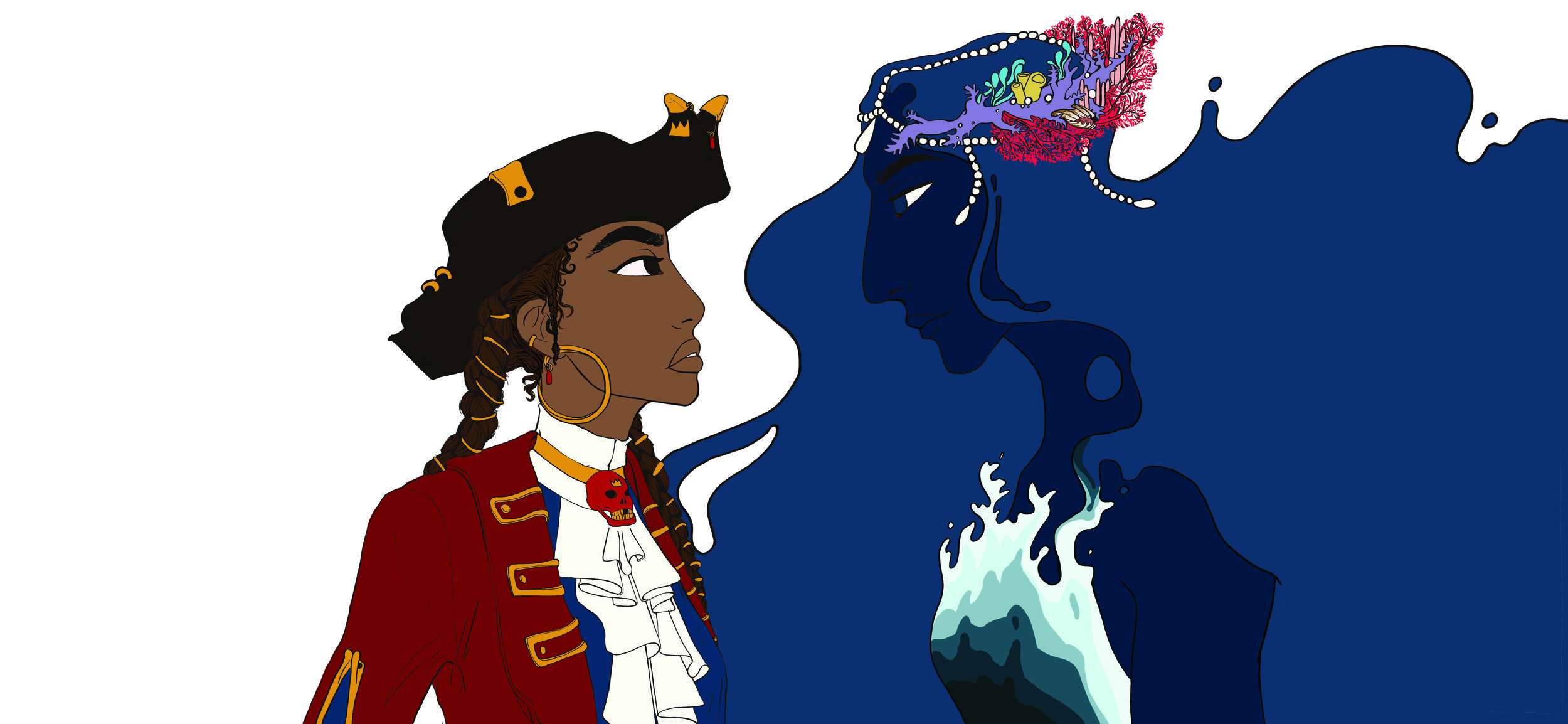
With both the artistic and technical elements established, production could officially start. I was drawing each page as a spread because it was easier for me to get a sense of the connection between the pages when drawing them together. My original plan was to draw one spread a week, that is 16 spreads in total, not including the cover, which raises the total amount of drawings to 17. Even if I drew one spread a week that would still take around 4 months. Thus, there was a definite time concern. Especially when I also needed to account for the printing time and the shipping time from the printer delete. The printer estimated one month before submission for printing and binding. Thus, the work should be sent to the printer no later than the 25th of April, to allow some leeway for delays and other situations that might arise. I started drawing the first spread in late January. I started with page 11 and 12, this is the scene where the Pirate Captain and The Sea are face-to-face for the first time. I chose to start with this spread as it has both the lead character and it is an important turning point in the story. My intention was to use this page as a style reference that would dictate how I approached the colouring for the rest of the book. I had decided to go for a cell shaded approach as that is less time consuming than realistic soft shading. However, there are still nuances in how you blend the layers and what colour value one uses for the highlights and shadows. I had also decided to colour the line art. I debated having no line art because it can help soften up the impression of the illustration and hard lines can sometimes come across as «comic-book-like». I knew I wanted the lineart as I work faster when I have lineart to base the colouring around. The line art functions as a buffer space between the different colours and creates definition quickly. This buff space is vital because it means you only have to smooth out your line art, rather than smooth out every transition between colours. The colouring of the lineart turned out to be a crucial choice as, although it looked nice, it took longer than I had originally anticipated. However, I would not have wanted to change that because I feel that the coloured outline gave a very nice effect. Take spread 11 and 12 as an example, the vibrant blue outline of The Sea is vital for the definition of her face, but it also creates a glowing feeling which contributes to her ethereal beauty.


The time I spent on creating page 11 and 12 is not reflective of the time spent on the other pages. This page took longer due to me having to figure out what colouring pipeline I wanted to adapt. Additionally, it was the first proper lineart I was doing for the book and I felt tremendous pressure in getting it right. As I worked on the scene I experimented with the lighting and the colour values, the shading and colouring technique and the colour correcting afterwards. This one-page spread took about a week to complete, whilst the later ones averaged at about 2 days. In the end, this page was too detailed to replicate across the book. As the process went on, I changed not only my workflow but also the colouring approach, to work more efficiently. A major issue was sketching the pages. Whilst I had my page drafts, they were in many cases not detailed enough to use as the actual sketch layer/draft layer. I personally prefer having this layer be fairly detailed so when I create the line art, it is mostly a matter of following the sketch below without having to make a lot of adjustments. However, sketching a whole page can be very time consuming, especially when trying to achieve the most detailed sketch possible. Up until this point I had been sketching in the same photoshop file as I would draw the rest of the project in. Fortunately, I had the idea to draw the sketches in Procreate, using my iPad. Instead of sketching the entire scene as one illustration I would sketch the individual elements and export them as transparent PNGs, that I could later puzzle together to form the full illustration. This would provide me with the opportunity to work more portably, and not be chained to my desk. An important note is that I could not draw entire pages in Procreate as there is a limit to how big your files can be. My pages were bigger than the accepted file size, thus I had to use photoshop to draw the majority of the project. I recognize that the idea of using an iPad to sketch is by no means revolutionary, however, It made a huge difference for me, my workflow and my health. Thus I consider this a very important event in my project pipeline. Whilst it had huge benefits, mainly being able to work from anywhere, it was not without a drawback. As each element was drawn individually there would sometimes be something slightly off about the perspective when the pieces were put together. This demanded some extra tweaking and experimentation to try to smooth out. Ultimately it was a relatively small problem in comparison to the benefit this approach had.
Changes in Workflow and Pages
Another major change was the process in which I drew the pages. My original idea was to work through the spreads one by one. However, as I switched to sketching on the iPad, I started bulk producing the sketches for the spreads. At that point, I had created 4 spreads, and it had taken around 6 weeks. I was behind schedule and needed to find a way to speed up production. I decided to switch my workflow from completing one page spread at a time to instead working in a conveyor belt fashion. I would first draw the line art for all the pages when that was completed I moved on to laying down all the flat colours, then finally completed the pages with shading and colour correcting. By using this approach it meant that I wouldn't be stuck with some pages that were fully completed and some there weren’t even started. By working this way I was able to produce more, faster, as I was always thinking about having to move onto the next page. It also gave greater variation in my work day, preventing me from going blind to a drawing because I’ve looked at it for 8 hours straight. This new workflow was very successful and I carried on working like that until the end of the project.
Another major change that occurred was the complete redesign of one of the pages. Page 19 and 20 was originally meant to be very lush and detailed, featuring the entire ship, crew, captain and some bystanders. However, this page was so ambitious that I knew it would take me at least a week to complete and I did not even have the base sketches for the page ready. Thus I decided to scrap the original design and create something simpler. This was a huge shame, I was looking forward to digging my teeth into such a complicated scene. However, I simply did not have time to do the illustration justice. Thus, for the sake of progress and health, I scrapped the page and went for something much simpler. At the end of the day, this was the right choice as the energy boost I got from clearing away something I had been dreading gave me the motivation needed to get more spreads done.
Changes in Techniques
I mentioned that whilst I attempted to use pages 11 and 12 as a style guide, and I did, just not to the extent I had originally intended, I had to change my approach as the project progressed. This is mainly in reference to the shading and the colour correction. On pages 11 and 12 I spent almost two days just tweaking the layer blending and adding highlight and gradients. However, as I had less and less time left I could not afford to take two days to work on one page. I also changed my shading technique. There is a trick to quick shading that I had originally intended not to use because I wanted more detailed and customized shading. The trick is taking one colour, often a vibrant purple or orange and lay down your shading, then set the layer blending to Multiply and lower the opacity till it looks natural. This gets you quick results, but can sometimes look flat. Whilst in the earlier pages I did I tried to avoid this approach I later caved in and used it on pages that featured many characters. I still avoided it for the Captain and The Sea, but for the crew and council I did end up using this technique. As I mentioned, the con is that the shading can look flat and boring, but the pro is that it ties all the shaded elements together as they have the same value shade. Thus, this felt more like a personal sacrifice than a sacrifice in the quality of the outcome.
Original Shading
New Shading: Normal Layer, Opacity 100%
New Shading: Multiply Layer, Opacity 35%
Printing
I managed to complete all the pages by the 8th of April, in line with my planning document. It was good that I managed to complete It so early as the process of sending it to the printer and getting all the final issues sorted out took about two weeks. I had misunderstood how the bleed worked and had not done it in the right way, thus there was a lot of back and forth and updating of the cropping of the files. I had added the bleed as a 3mm white border around the image, instead of extending the image by 3mm. I had made the pag spread 50cm x 22.5cm, whilst they needed it to be 25.6cm x 23.1cm. This is not a difficult job, it is just tedious and time-consuming. It was simply a matter of resacling the pages and since the file i had drawn in was 25% bigger than the final size, it did not result in any quality loss. When this was finally sorted, I requested a print test to be able to confirm the layout of the book and to see the colours printed on their paper. Since I had made sure the colour mode of my Photoshop files were set to CMYK and the dpi was 300, the aproportiate setting for optimal print quality, there was no issues with the print test. In the end it had taken longer than I expected to get everything in order, so I am very glad I was able to finish so early because any later could have led to some serious issues with printing times.
The imag to the right was sent from the printer as a guide for how I needed to rescale and recrop the images. Here you see that I had misunderstood and added a white border as the bleed instead of extending the image 3mm.

Exhibtion
For detailed description of the work done in preperation for the show itself please see Research: Exhbition. Below are the sketches I did of my setup and different options for how it can fit into the space allocated to me. My main goal with the exhibition space is that it is a place where people can sit down. I feel that by sitting down it gives people the chance to actually take the time to read the book instead of just standing and looking at it.
Evaluation of Production
Production was affected by the delay in pre-production, resulting in the inability to spend as much time as I had originally intended on each page spread. This can be seen in the adaption of a shading technique that is faster but with slightly less detail. It also led to the complete redesign of a major page, forcing me to cut down the detail significantly. These were the majorly negative outcomes of the delay in the pipeline. However, I tried to remedy them by switching production method. Going from creating one page spread at a time, to completing each element of the illustration (line art, colour, shading, colour correcting) for all the pages, before progressing to the next stage. This did save me time and let me send the pages to the printer early enough to account for delays in the finalization of the work. Whilst there were inevitable cuts and changes to the project it does still represent my vision as a whole. The effectivising of the process led to some sacrifices in detail, but it opens up the chance to further work on the project. As my intention is to get the book published I now have a clear idea of what I need to update and change before I start the process of publication. Mainly, fine-tuning the shading and colour correcting, and updating page 19 to 20 so that it fits my original draft. Furthermore, I will have time to redesign the ship. As I mentioned earlier, I did not have time to fully design the ship, thus I ended up with fairly generic environments. Therefore, my further work will be focused on designing and implementing the ship into the pre-existing pages.
Evaluation
On the whole, this project has been a huge learning experience for me. Working from start to finish under a strict deadline has taught me valuable lessons on how to prioritize. The constant process of reevaluating what is essential and what can be cut was very challenging, especially on a project that is so personal to me. I have learned to be stricter with myself in regards to how long I spend in pre-production as I experienced how big of an effect it had on the project as a whole. In the end, there will always be delays. I dealt with them to the best of my ability and whilst some sacrifices were made I managed to stay true to my goal with this project. I created a book that I hope can inspire other artists to be more diverse in their work and to take more chances and risks in the fight for representation. Censorship is still a problem and we as artists must work to break down the stigmas around LGBT representation and show that love is love, no matter the gender or orientation. That is the purpose of this book. To introduce children to the diversity of the world and by that, hopefully, create a more tolerant future.
References
Adobe.com. (2019). Font licensing centre | Adobe Type. [online] Available at: https://www.adobe.com/uk/products/type/font-licensing/licensing-faq.html [Accessed 10 May 2019].
Adventure Time. (2010). Cartoon Network. (05/04)
Advocacy, Legislation & Issues. (2019). Free Downloads. [online] Available at: http://www.ala.org/advocacy/bbooks/bannedbooksweek/ideasandresources/freedownloads [Accessed 8 May 2019].
Advocacy, Legislation & Issues. (2019). Top Ten Most Challenged Books Lists. [online] Available at: http://www.ala.org/advocacy/bbooks/frequentlychallengedbooks/top10 [Accessed 8 May 2019].
Ahmad Idk. (2016). Steven Universe - What Can I Do For You UK CENSORSHIP LESBIANS. Available at: https://www.youtube.com/watch?v=pUB1MvqCklU [Accessed 8 May 2019]
The Amazing World of Gumball. (2008). Cartoon Network. (8/05)
Becker, B. and Denton, K. (2011). The sniffles for Bear. Somerville, Mass.: Candlewick Press.
Bundo, M., Twiss, J., Keller, E. and Pence, C. (2018). A Day in the life of Marlon Bundo.
Cartoon Network Europe (2016). In response to the recent complaints about Steven Universe. [online] Available at: https://m.facebook.com/CartoonNetworkEurope/posts/10153713467716041 [Accessed 16 May 2019].
Donaldson, J. and Scheffler, A. (2006). The Gruffalo.
Duddle, J. (2018). The Pirates of Scurvy Sands.
En.wikipedia.org. (2019). Obergefell v. Hodges. [online] Available at: https://en.wikipedia.org/wiki/Obergefell_v._Hodges [Accessed 8 May 2019].
Fletcher, T., Poynter, D. and Parsons, G. (2012). The dinosaur that pooped a planet!.
Geisel, T. (1960). Green Eggs and Ham. 1st ed. New York: Beginner Books [u.a.].
Haack, D. and Lewis, S. (2018). Prince & knight.
Herthel, J., Jennings, J. and McNicholas, S. (2014). I am Jazz!.
Kautzer, K. (2019). Exploring genre | How to write a fairy tale. [online] WriteShop. Available at: https://writeshop.com/genres-how-to-write-a-fairy-tale/ [Accessed 9 May 2019].
Legend of Korra. (2012). Nickelodeon. (14/04)
Love, J. (2018). Julian is a mermaid. London: Walker Books.
Newman, L. and Souza, D. (1989). Heather has two mommies. Los Angeles, Calif.: Alyson Publications.
O'Neill, K. (2016). Princess Princess. Portland, OR: Oni Press.
Richardson, J., Parnell, P. and Cole, H. (2005). And Tango Makes Three.
Sendak, M. (1963). Where the Wild Things Are. [New York]: HarperCollins.
She-Ra and the Princesses of Power. (2016). Netflix/Dream/Works Animation Television. (13/11)
Steven Unvierse. (2013). Cartoon Network. (21/05)